Lorent
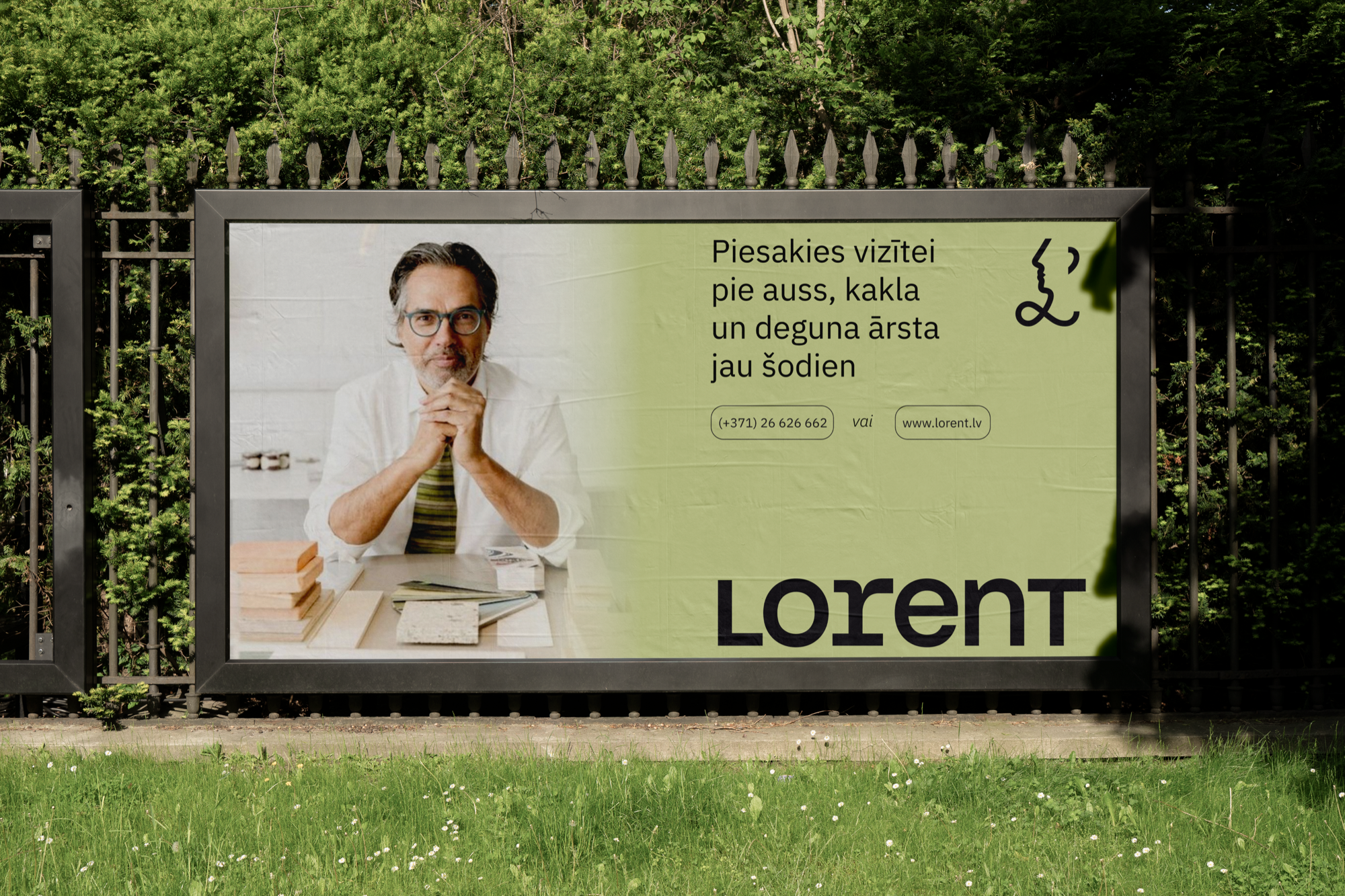
ENT clinics all look the same: sterile blues, stock photos of smiling families, a stethoscope somewhere. Lorent wanted none of it. They asked for a modern, friendly brand that a younger audience would actually trust — one that treats the ear, the nose and the throat with a bit of wit instead of clinical distance.
How do you make a doctor's office feel like a good idea rather than a last resort?

A face in one line
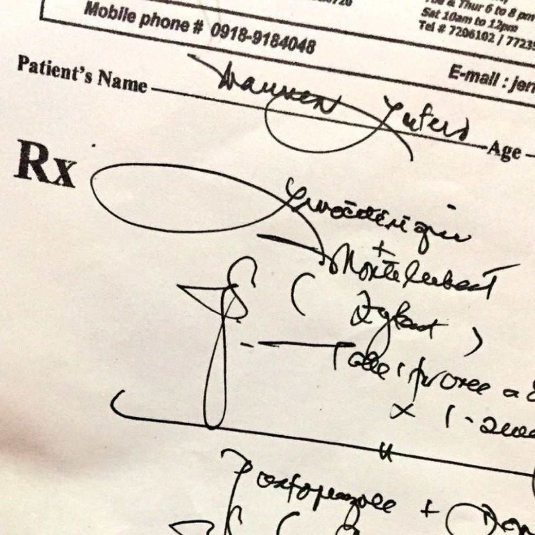
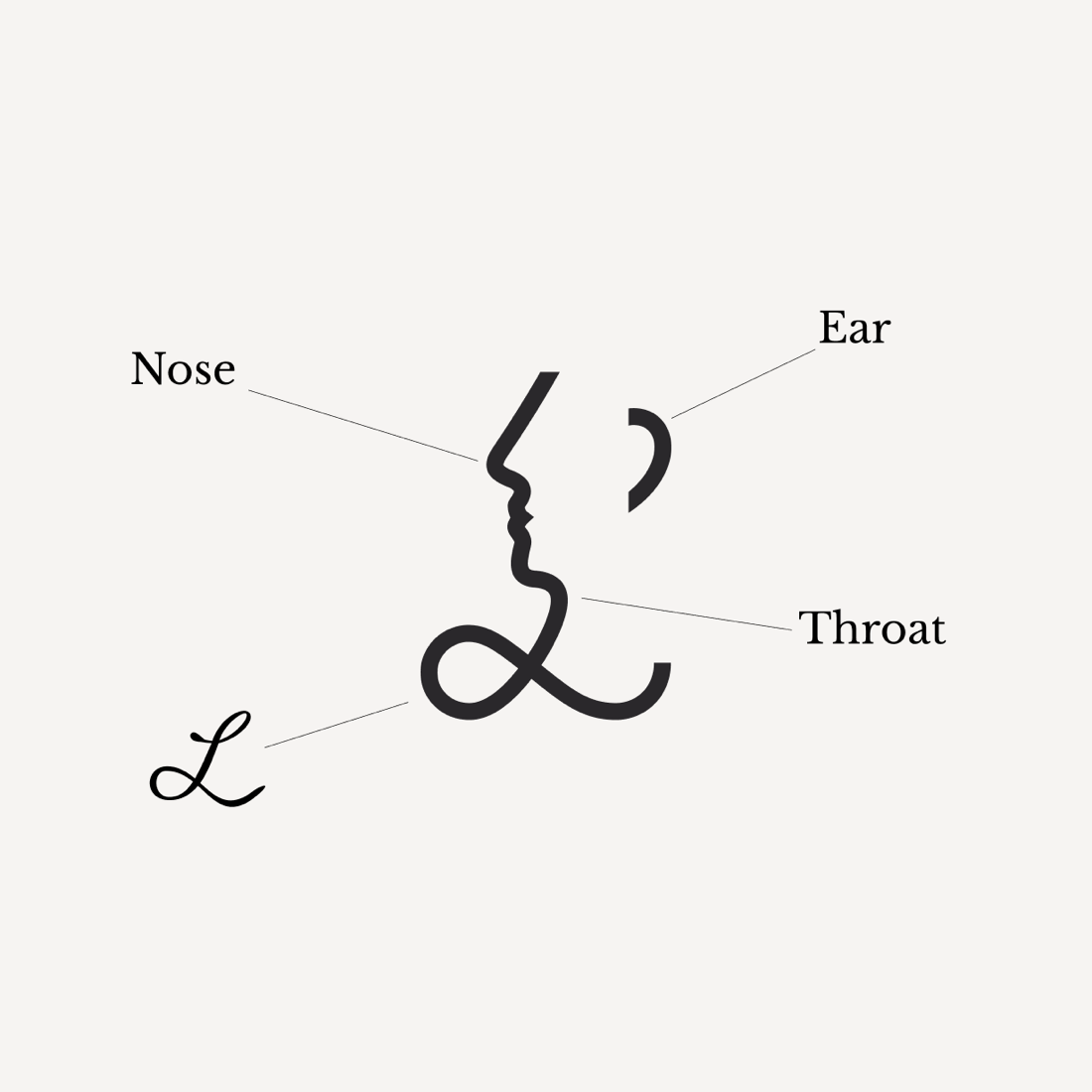
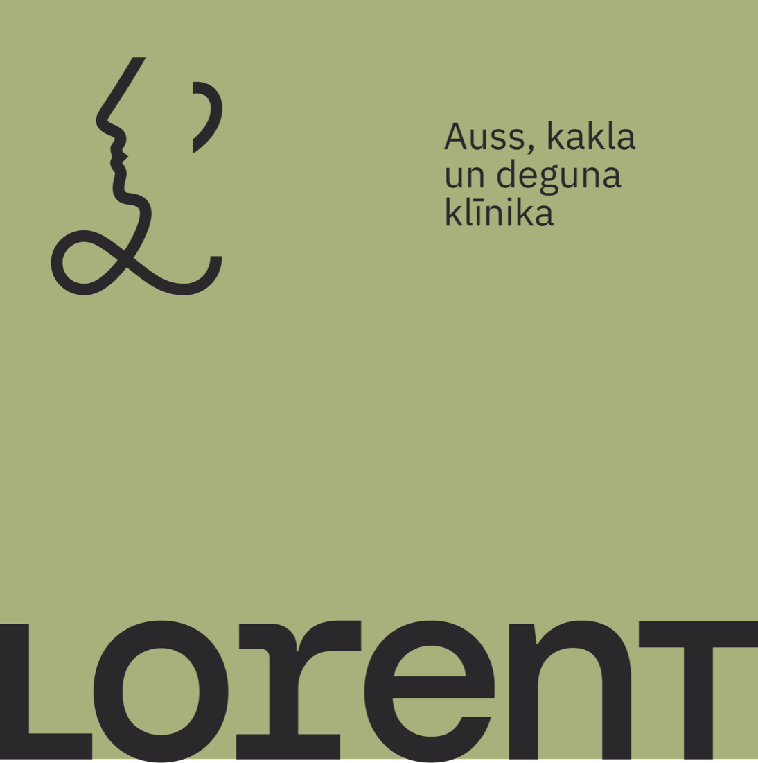
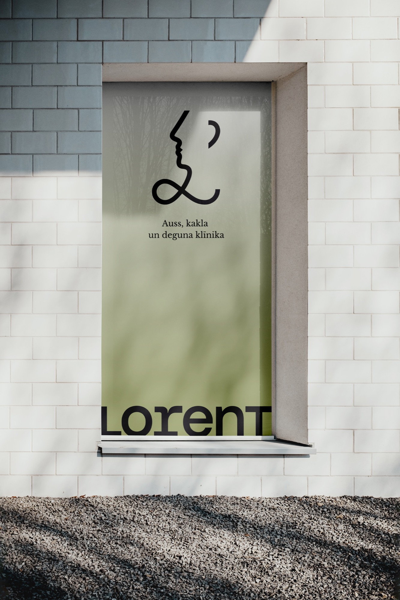
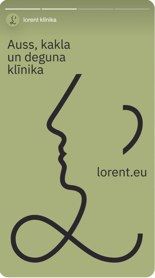
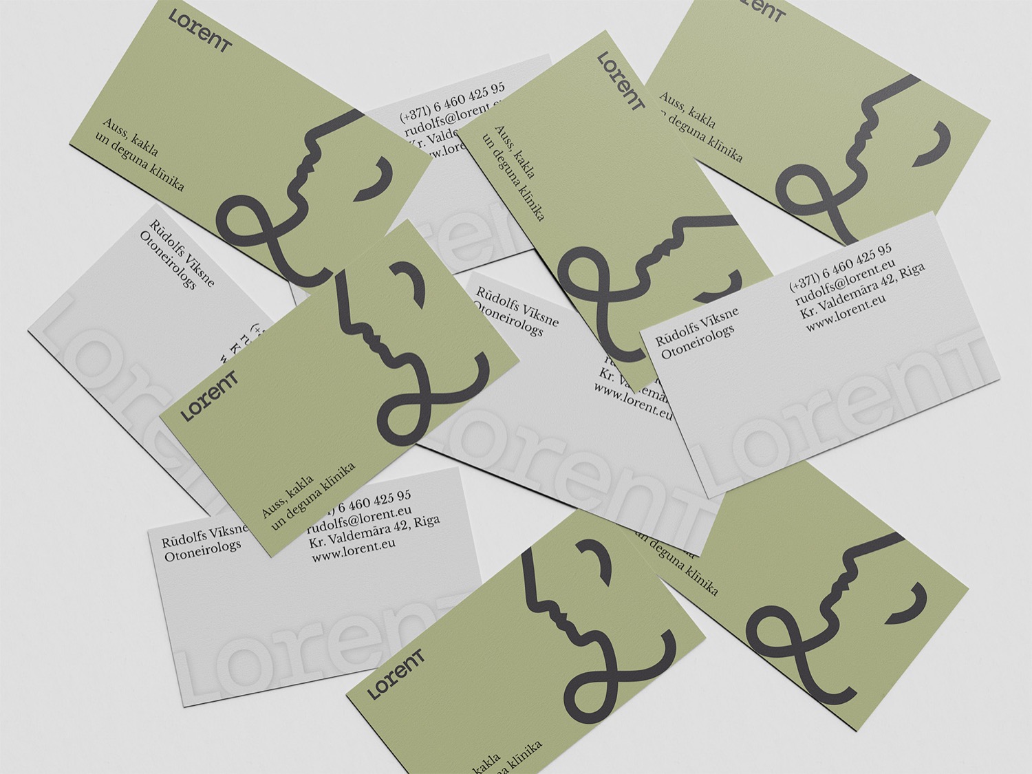
The logo starts where every patient's story does — with a doctor's handwriting, that famous unreadable loop. We kept the gesture but gave it a job: drawn in a single continuous stroke, the flourish becomes a face in profile. The nose, the lips, the curl of an ear — the three things an ENT actually looks after — and, read another way, a soft lowercase l for Lorent. One line that says ear, nose and throat without a single stock photo.
One Stroke, Everywhere
Ear, nose and throat are one connected system — so is the identity. The single-line face-mark, a rounded geometric wordmark, a warm sage green and a calm serif carry across signage, coats, cards and the clinic itself — quietly consistent from the reception desk to a doctor's chest pocket.





Out in the City
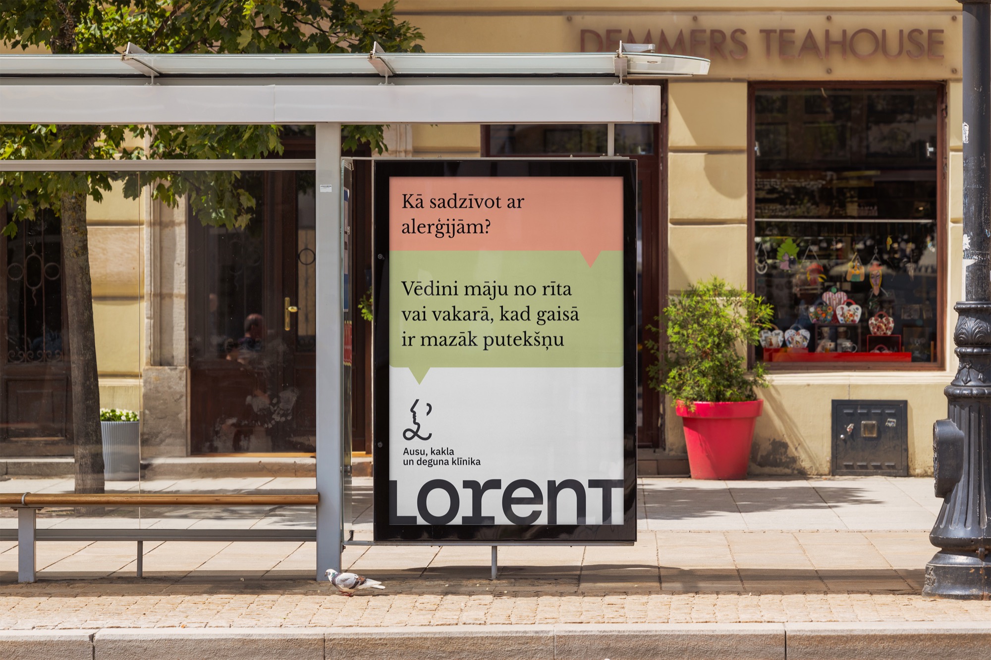
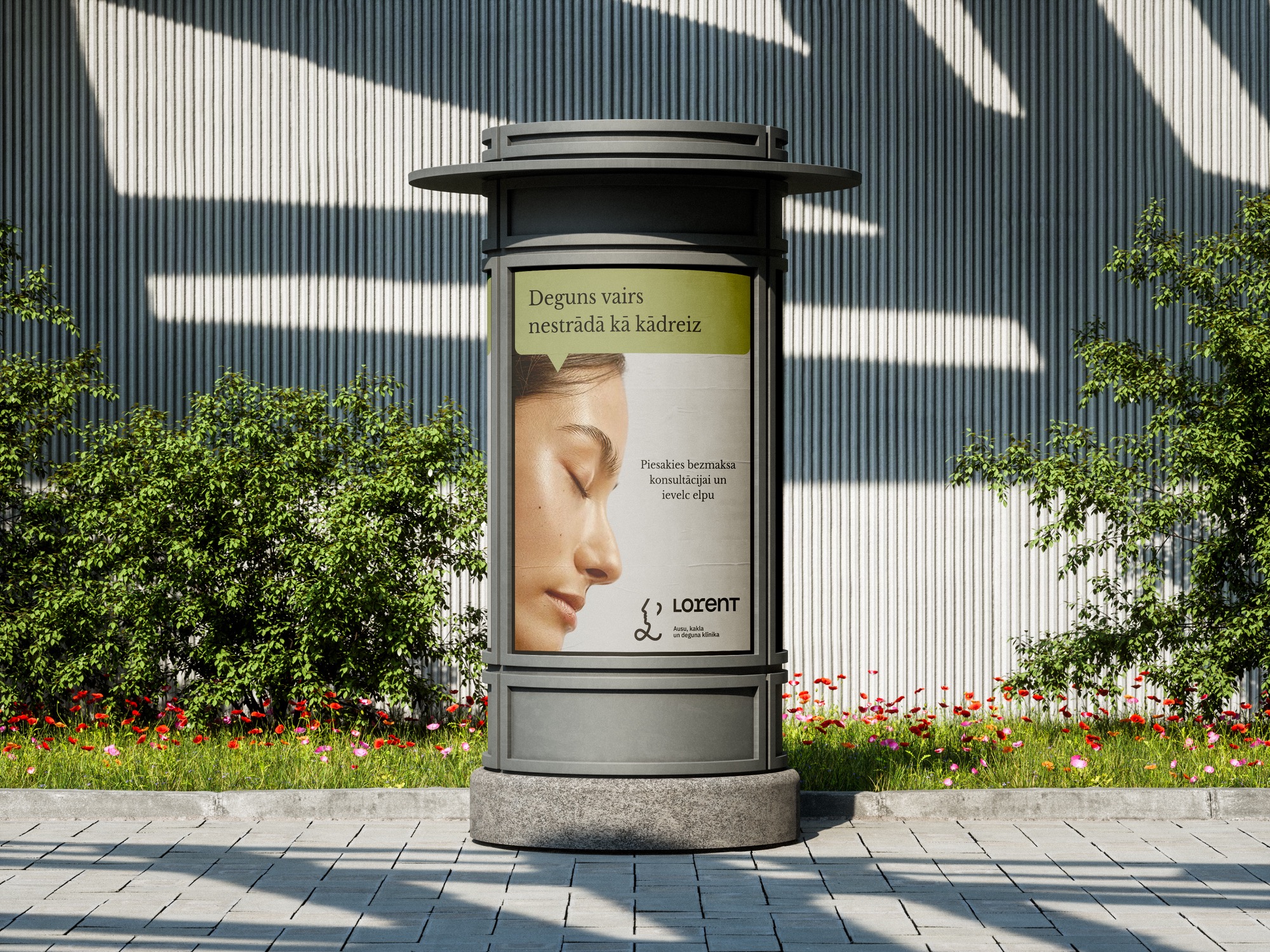
Bus stops, banners, billboards and clinic windows — the friendly voice meeting people where they already are, in the middle of an ordinary day.
Stories That Reassure
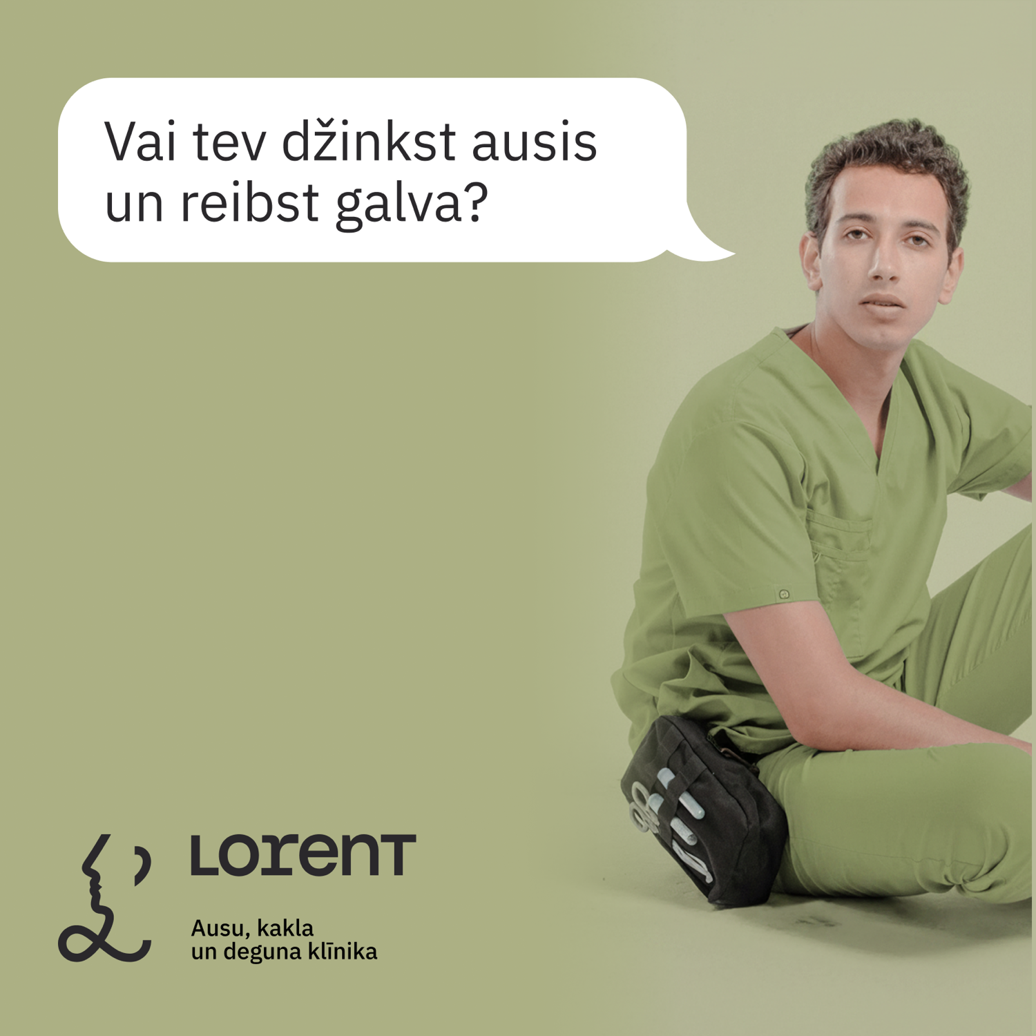
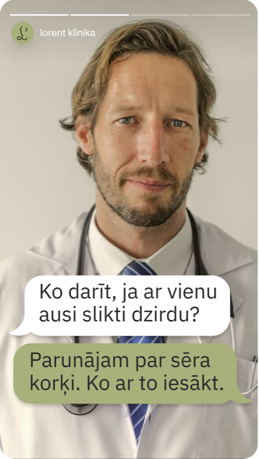
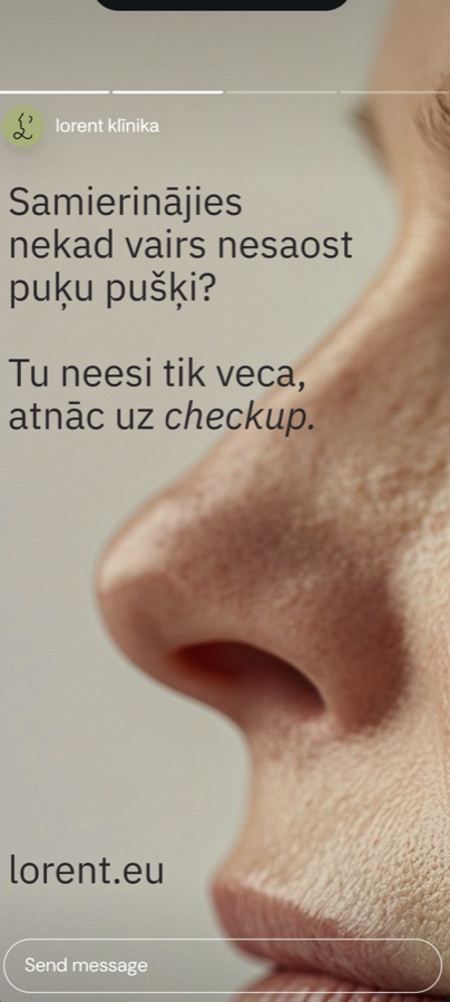
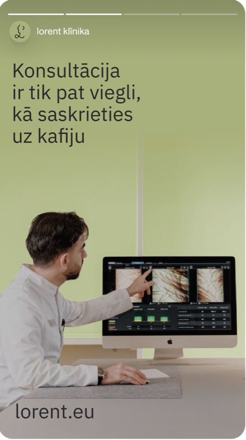
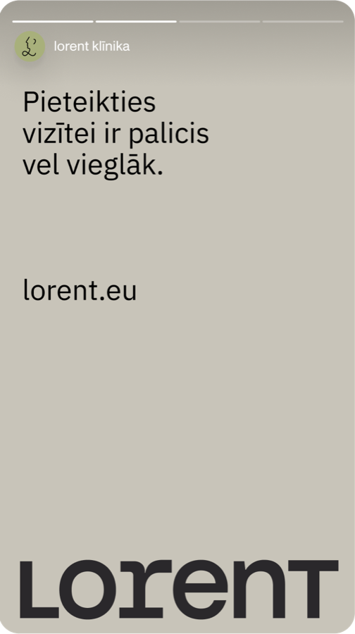
A set of Instagram Story templates built on the same type, colour and speech-bubble logic — light, human and quick to fill week to week.
In the Hand
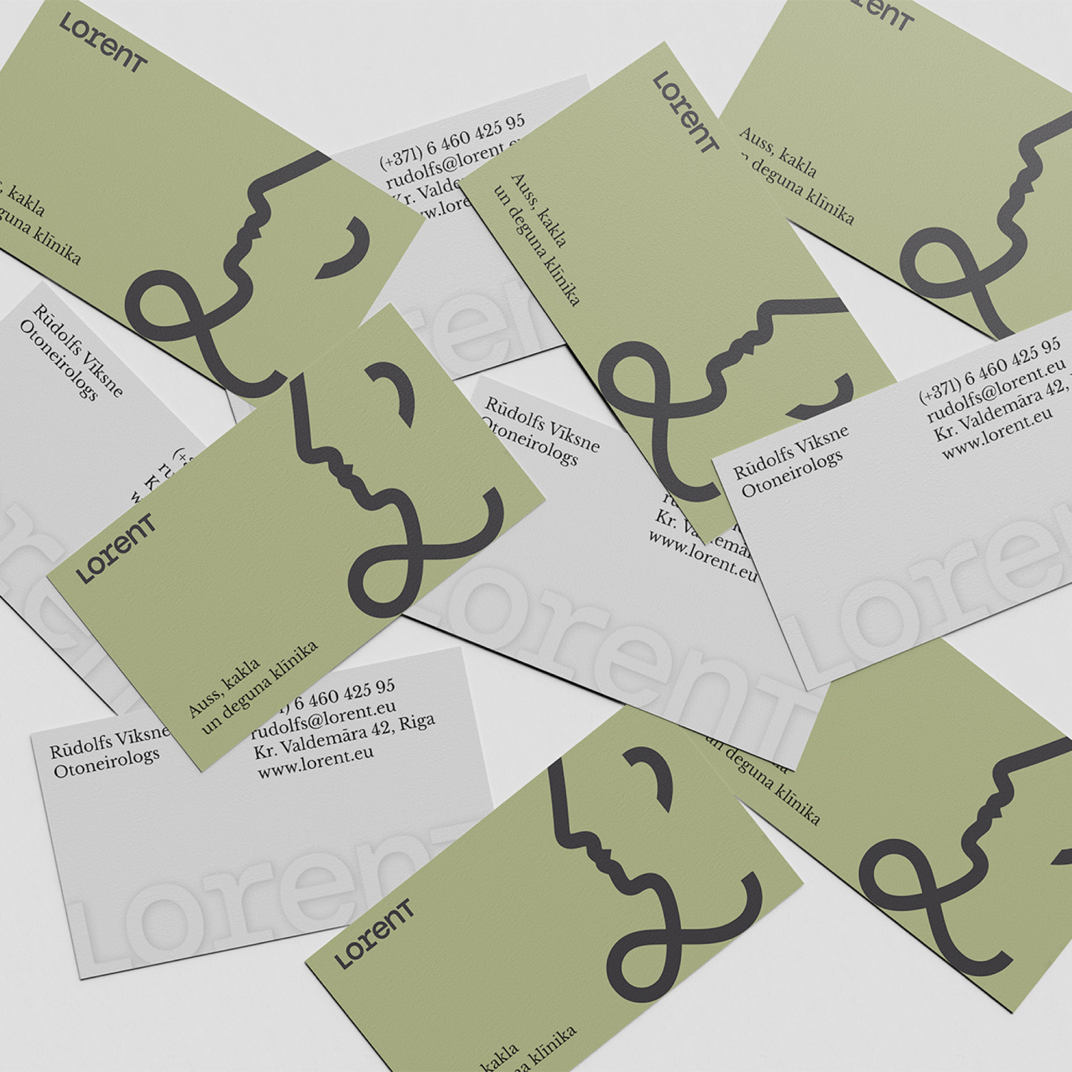
Two-sided cards that let the mark run right off the edge — the face on the front, the details on the calm reverse.
Ear, nose and throat — in friendly hands.