Granīts

A precision manufacturer with a humble product. Hinges aren't glamorous — they're bought by the thousand, judged on tolerance and reliability, and rarely thought about at all. Granīts needed an identity that felt as exact and dependable as the parts themselves, without pretending to be something it isn't.
How do you make a mark out of a hinge?






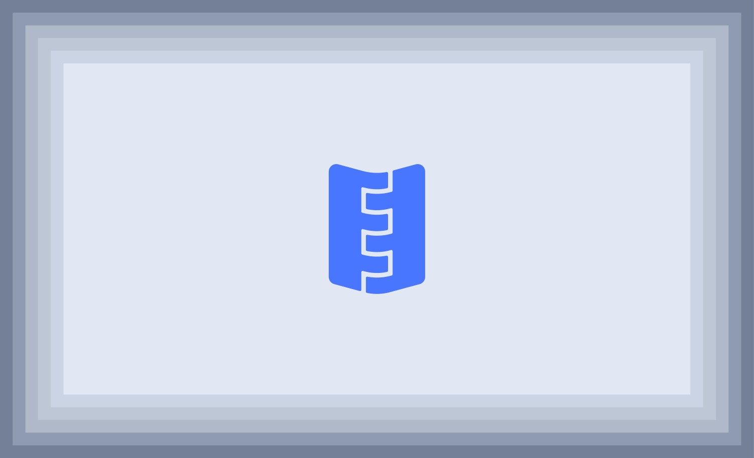
Sheet into hinge
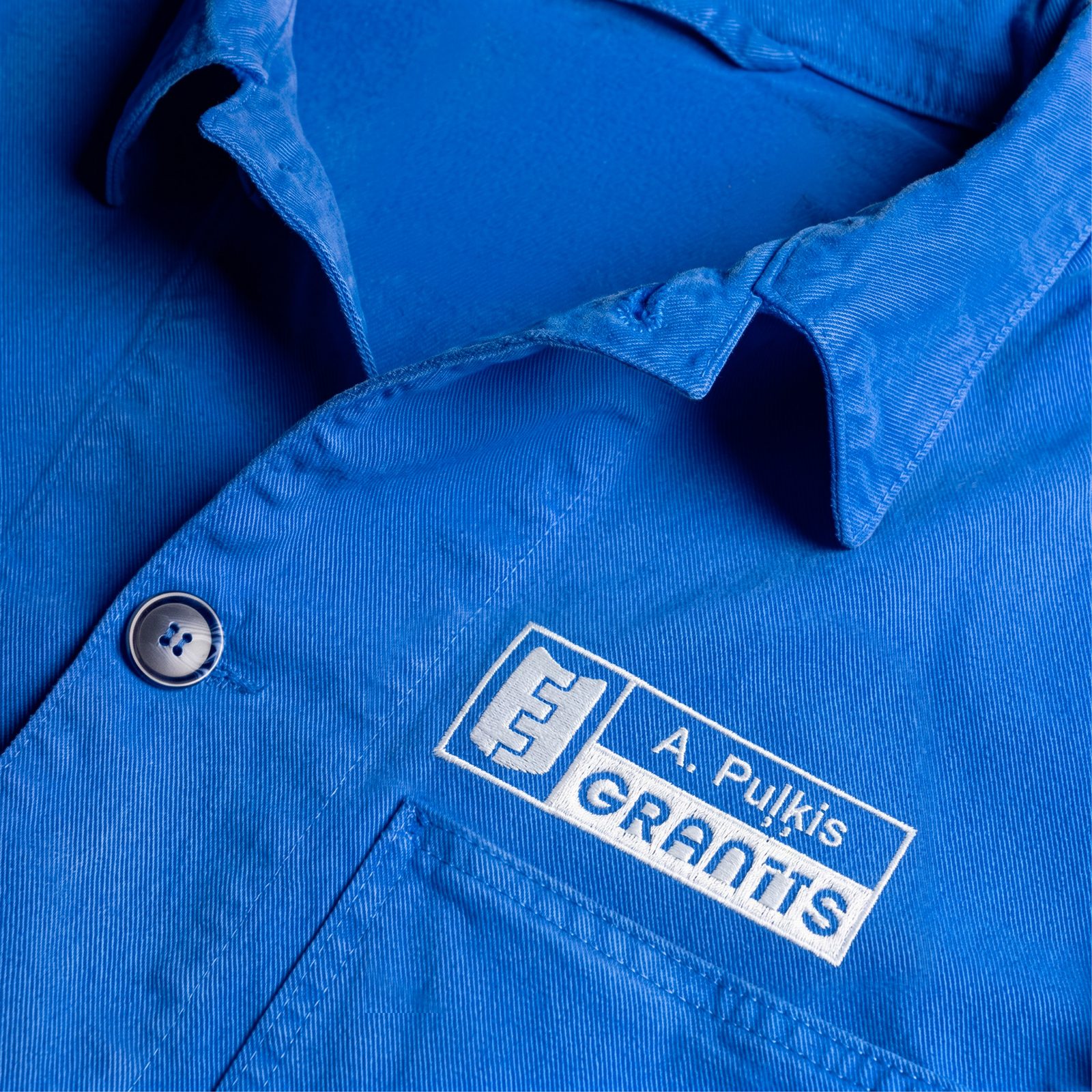
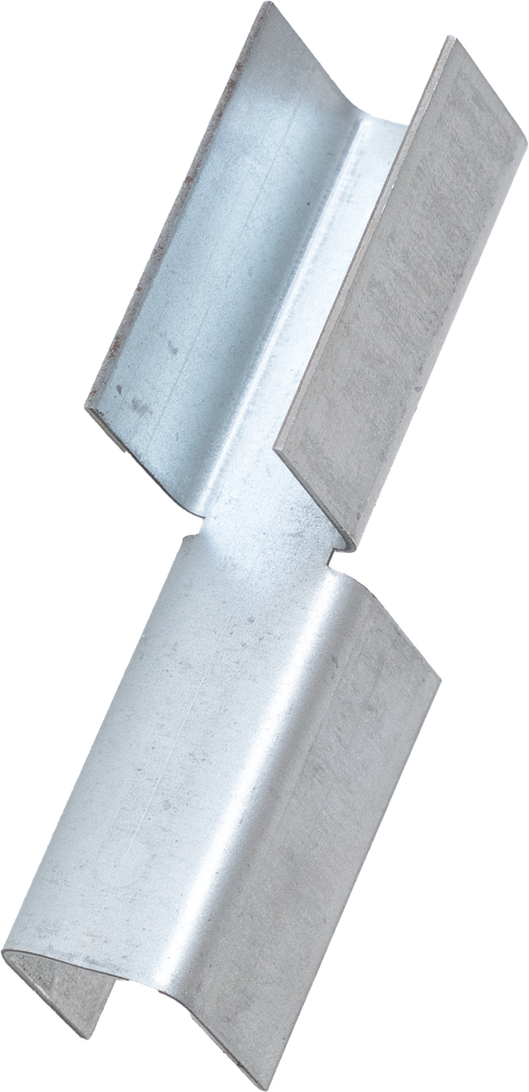
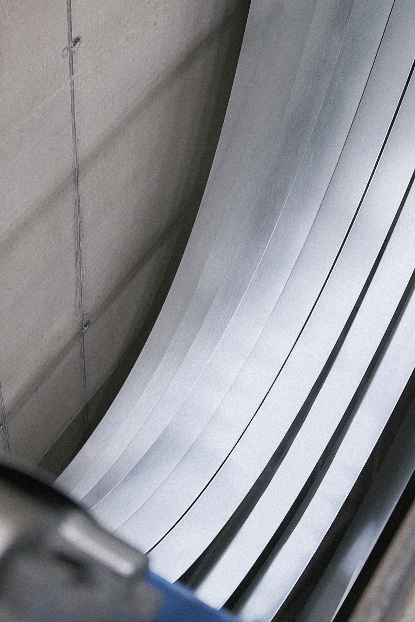
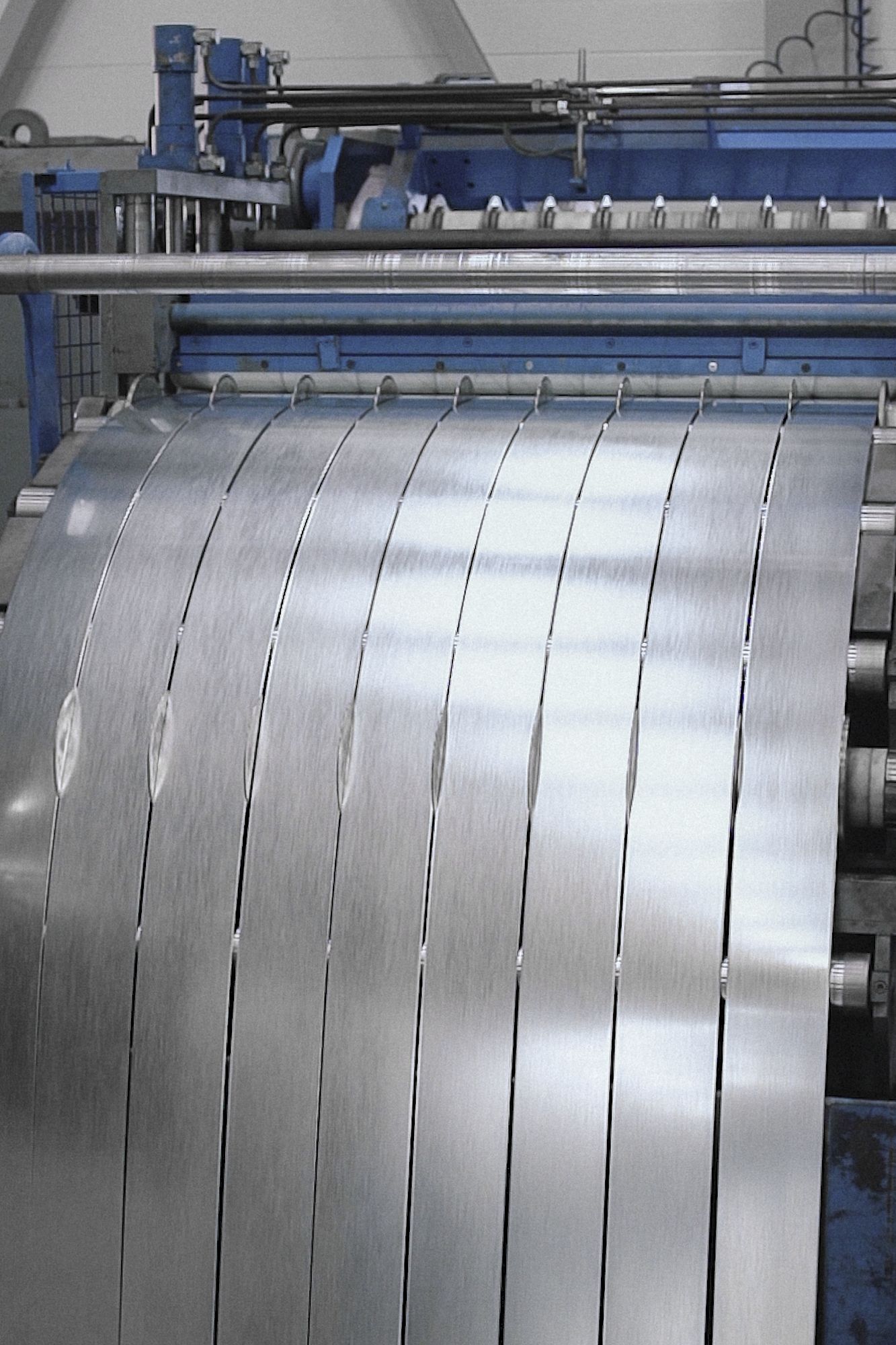
The mark is the manufacturing process, frozen. Flat sheets of steel stack, fold and press until they lock into the profile of a finished hinge — the exact move the factory makes every day. It gives Granīts a logo that isn't decoration but a diagram of what they do, and a system that can build and rebuild itself from the same simple parts.
The System in Use
The mark, the blue and the sheet-steel logic carried across the whole brand — lockups, patterns, powder-coated colour and everyday applications.

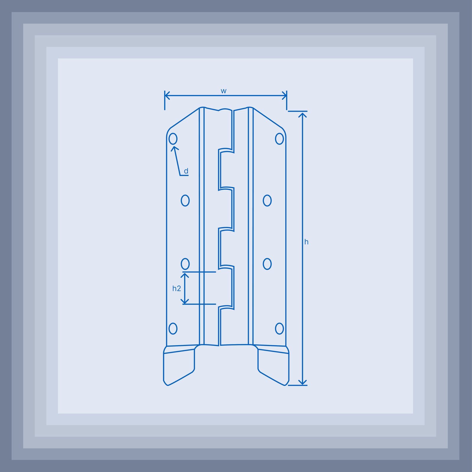

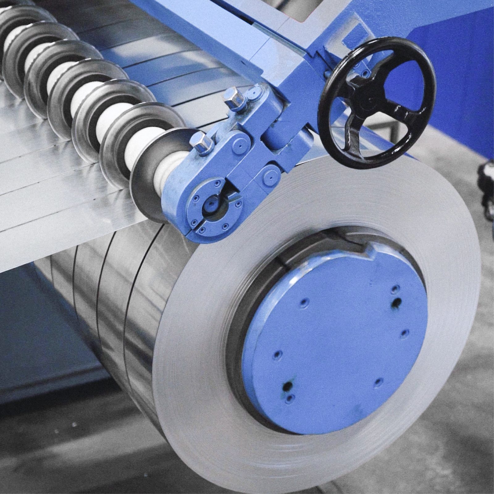
The Real Thing
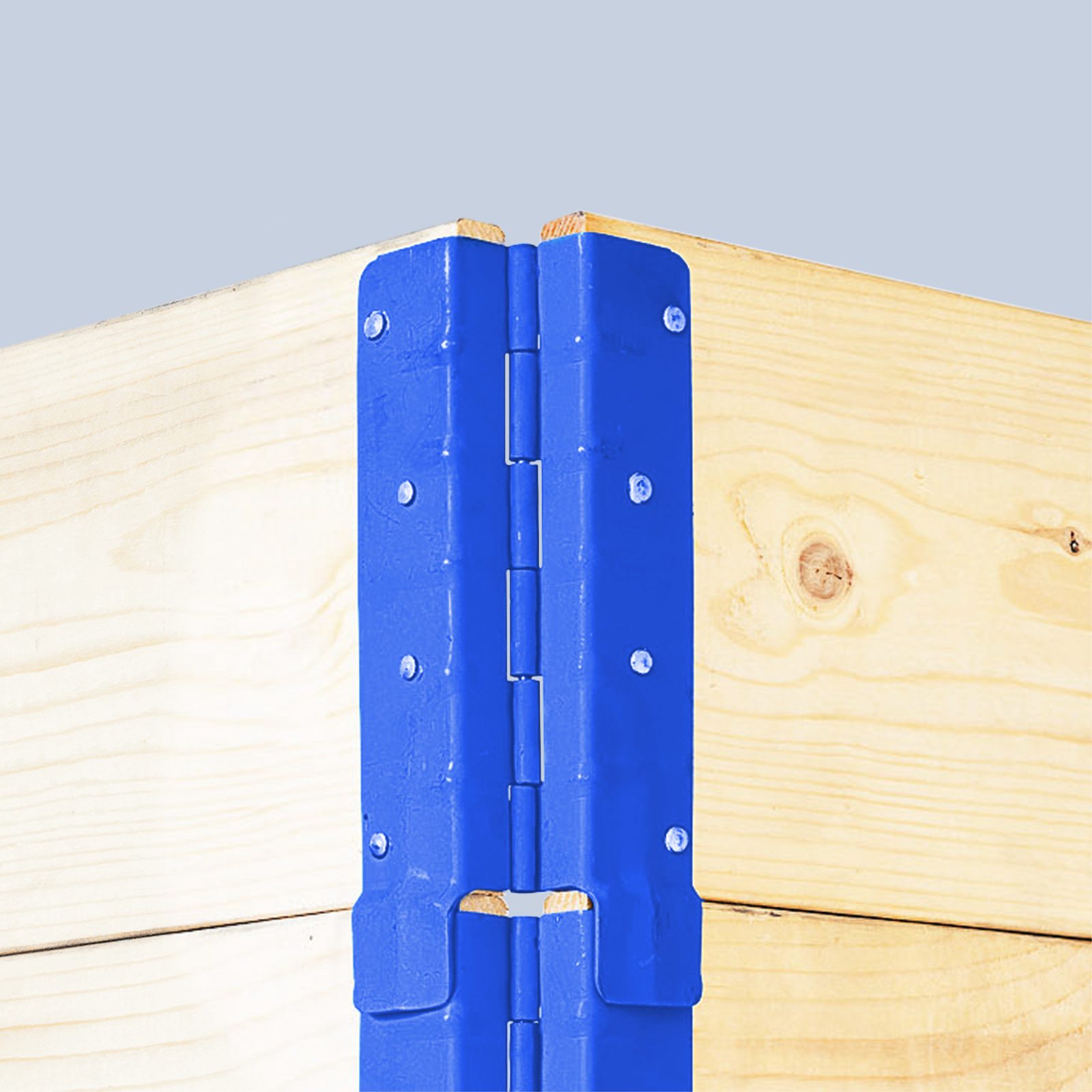
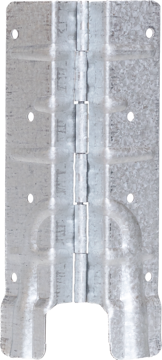
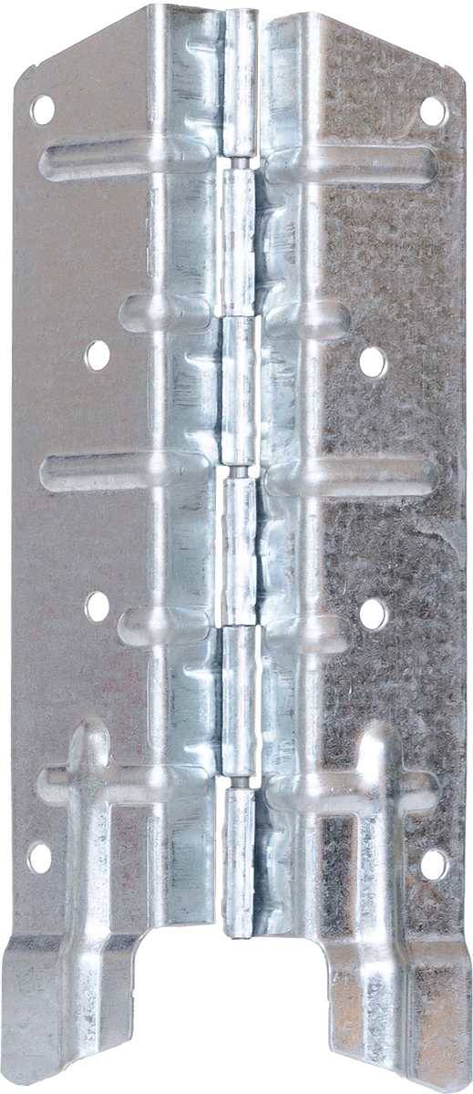
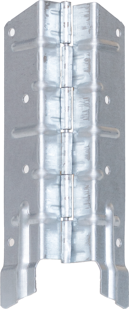
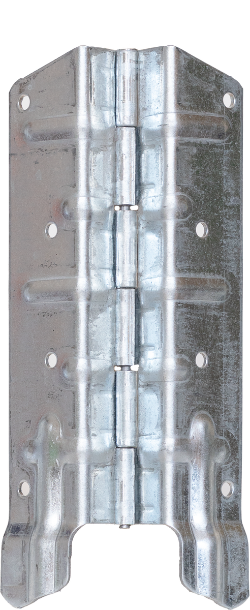
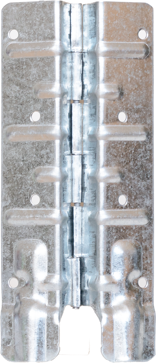
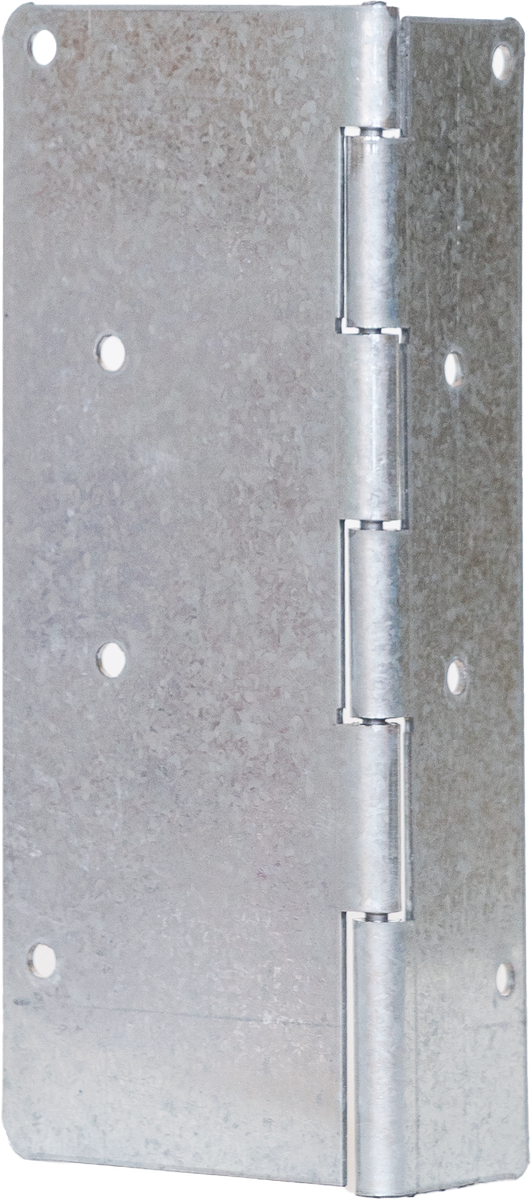
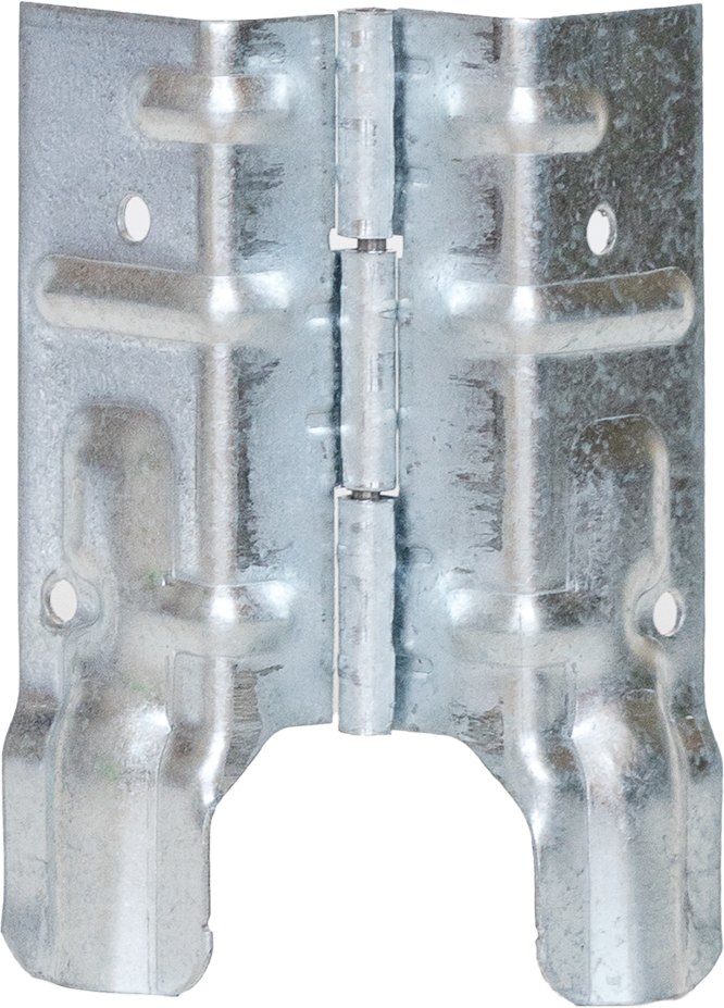
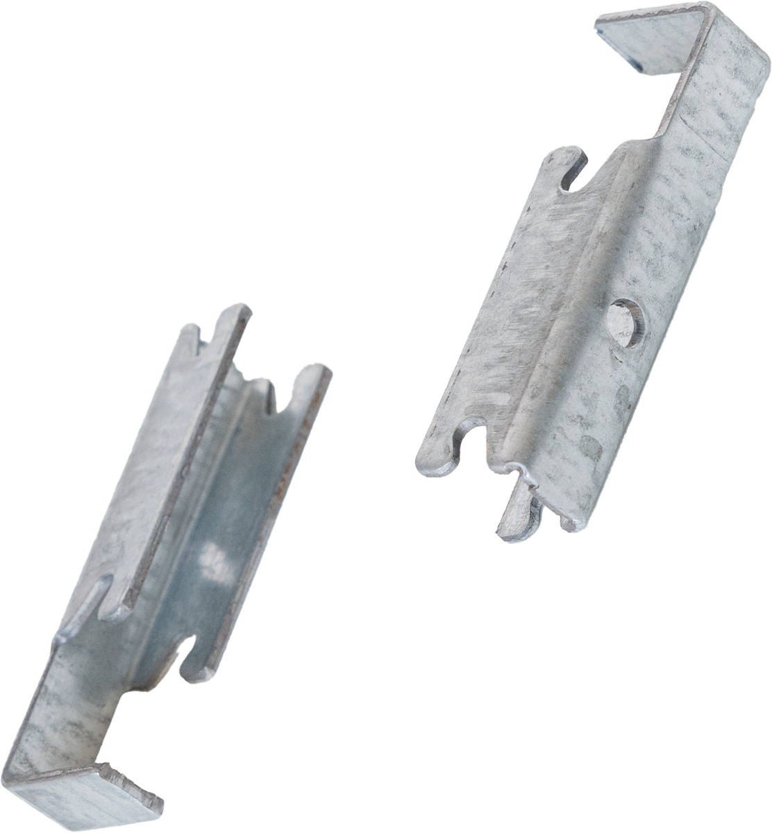
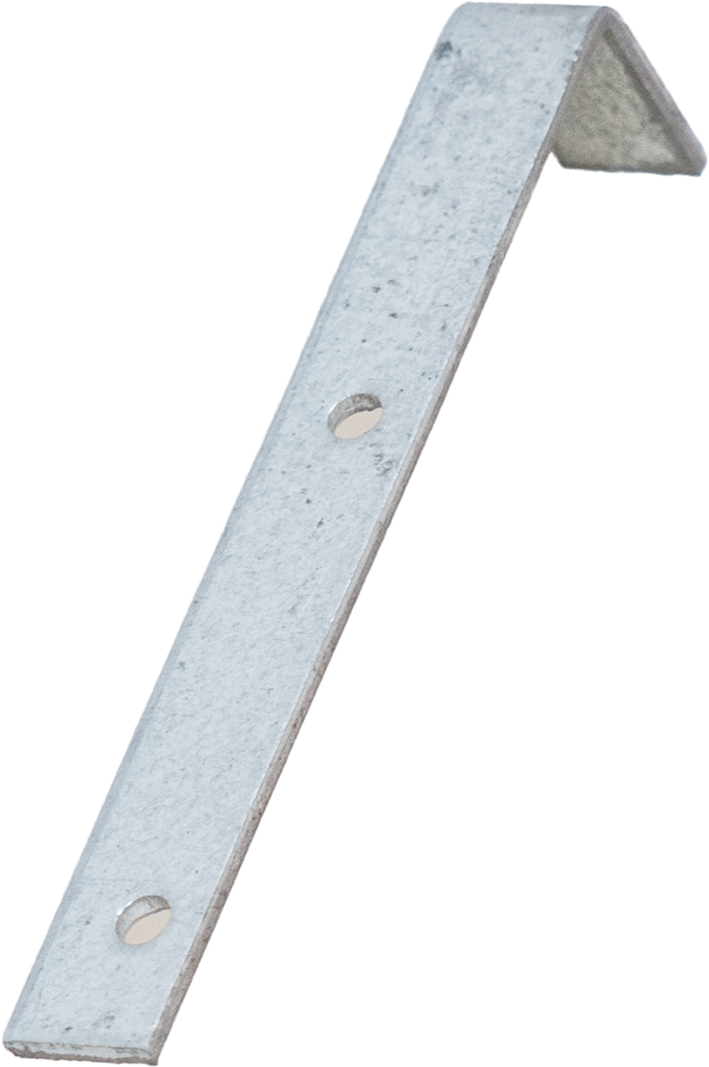
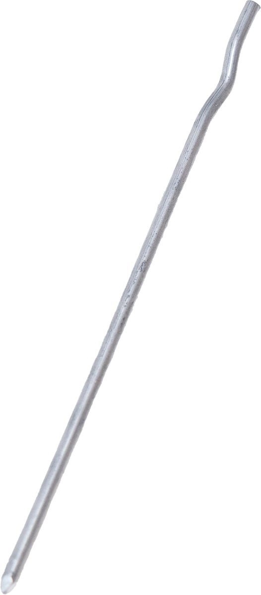
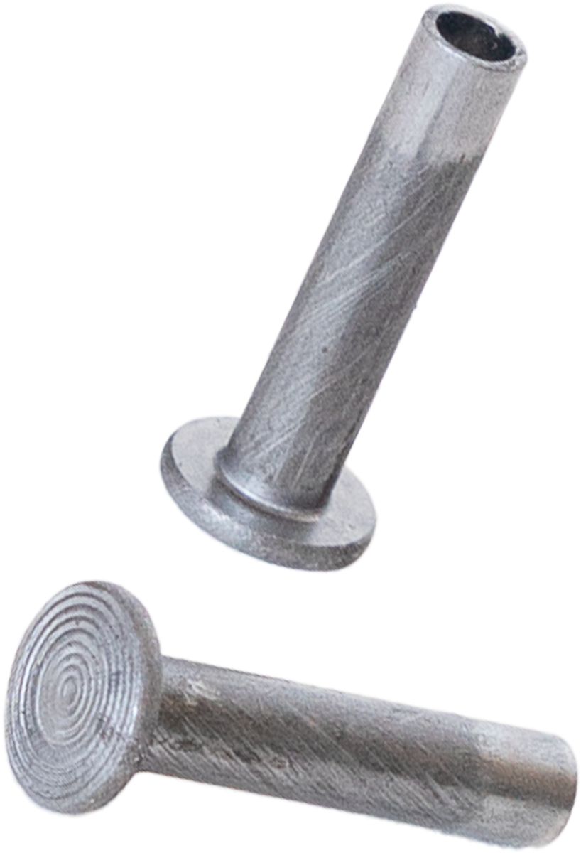
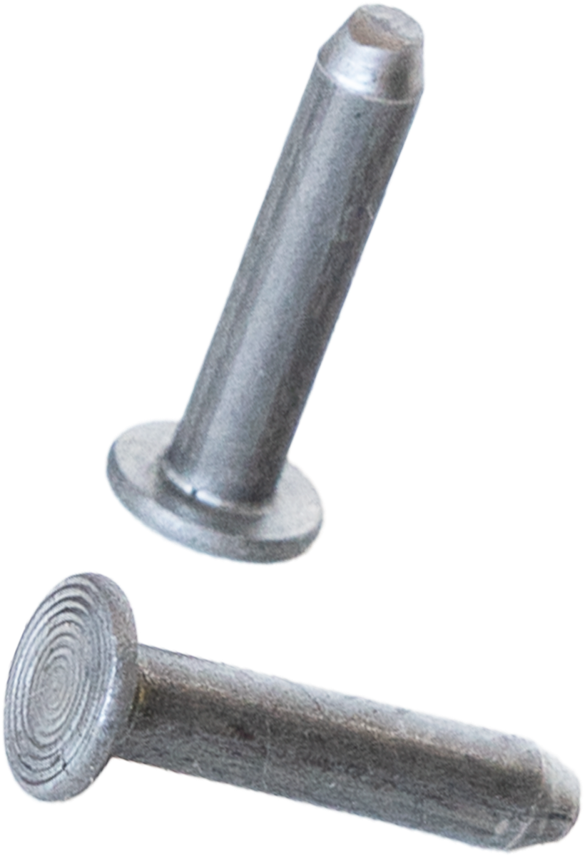
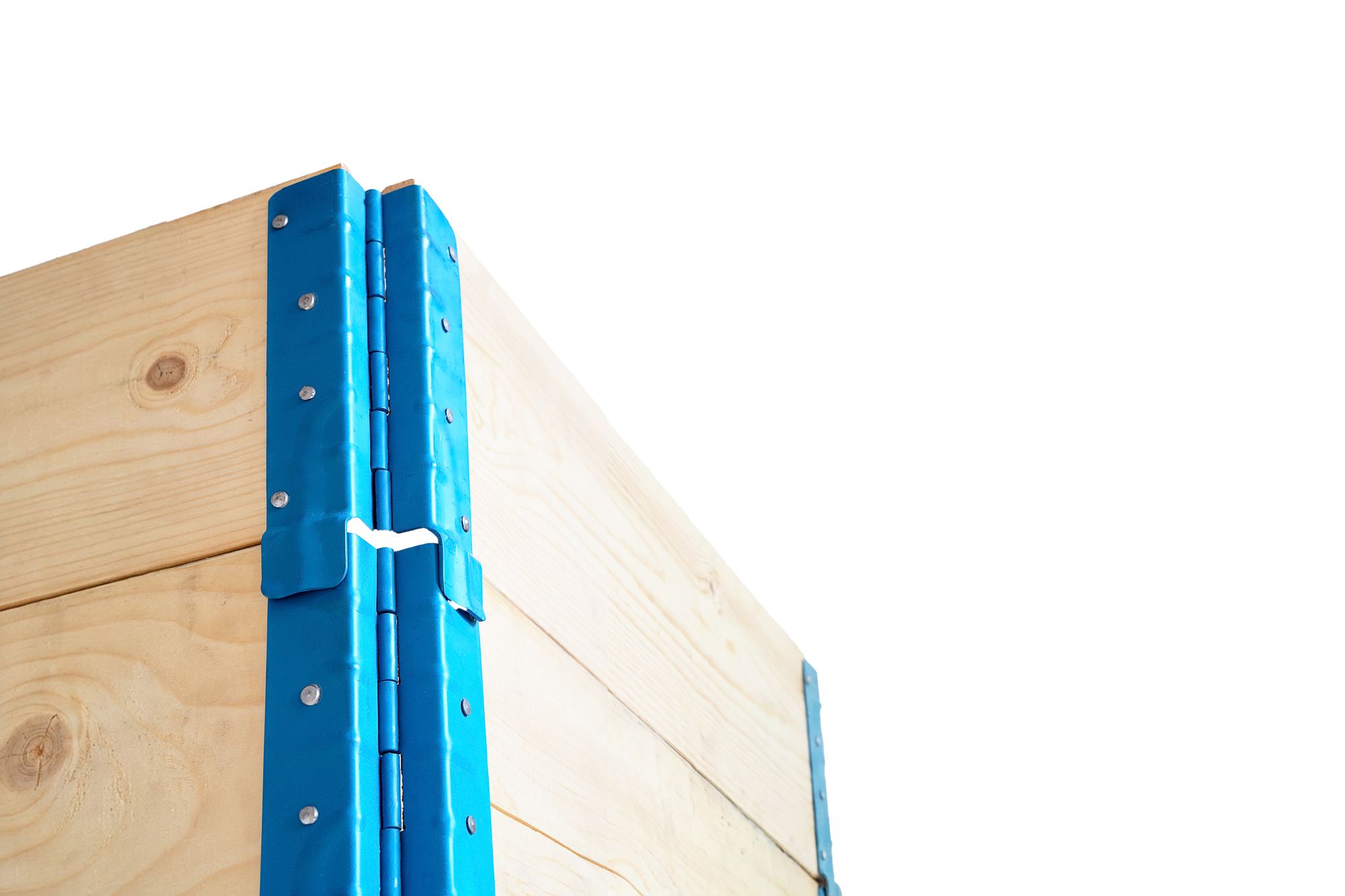
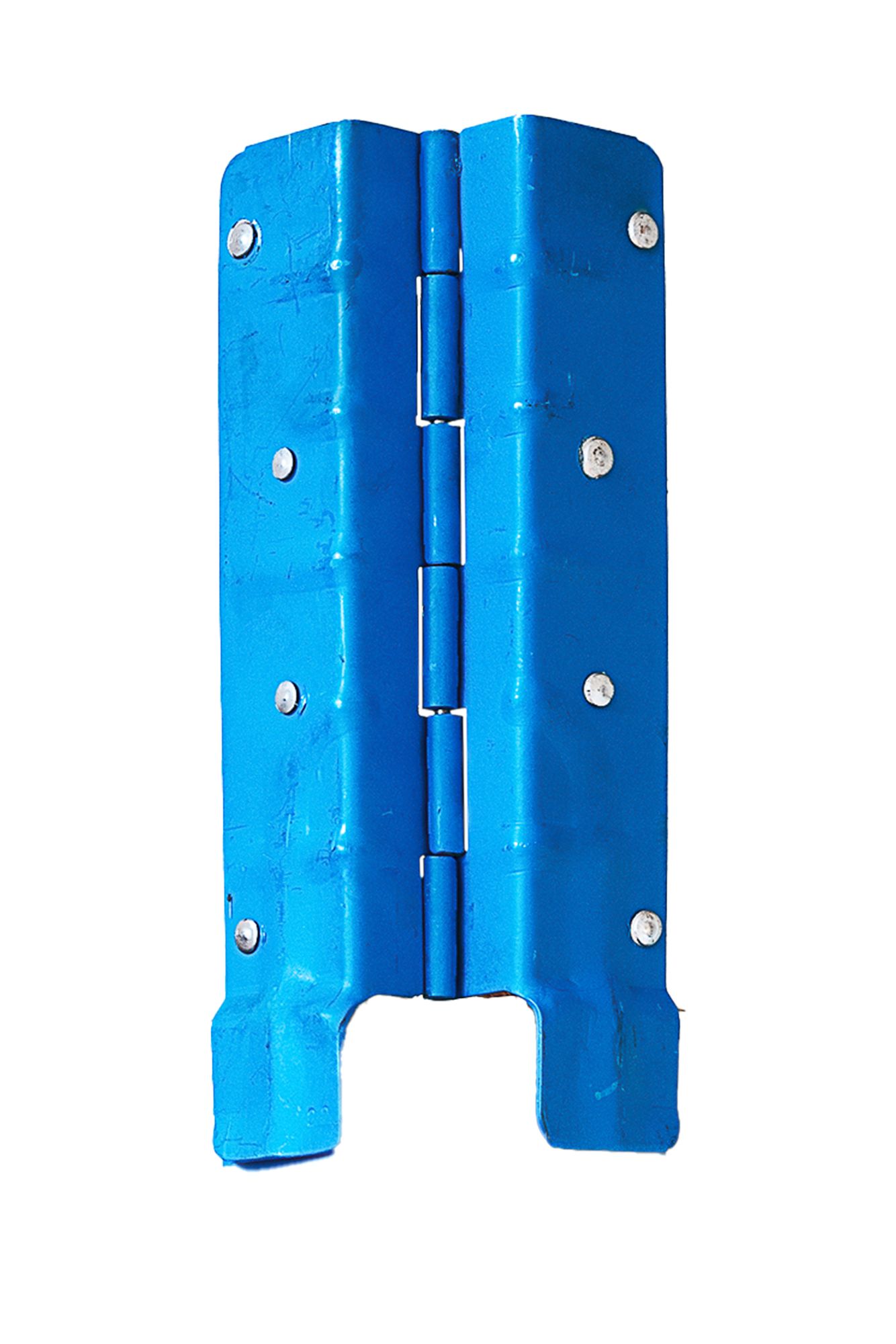
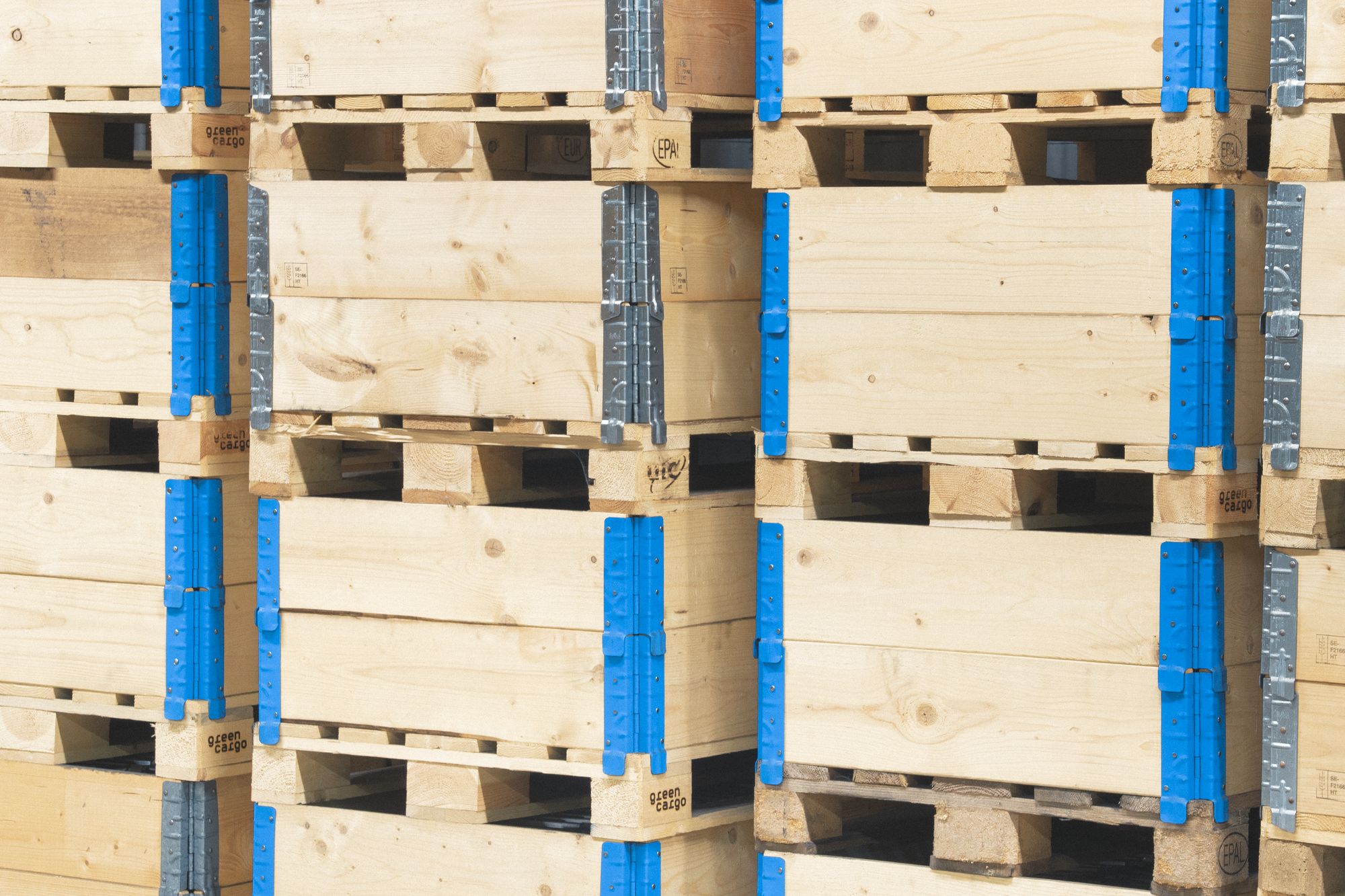
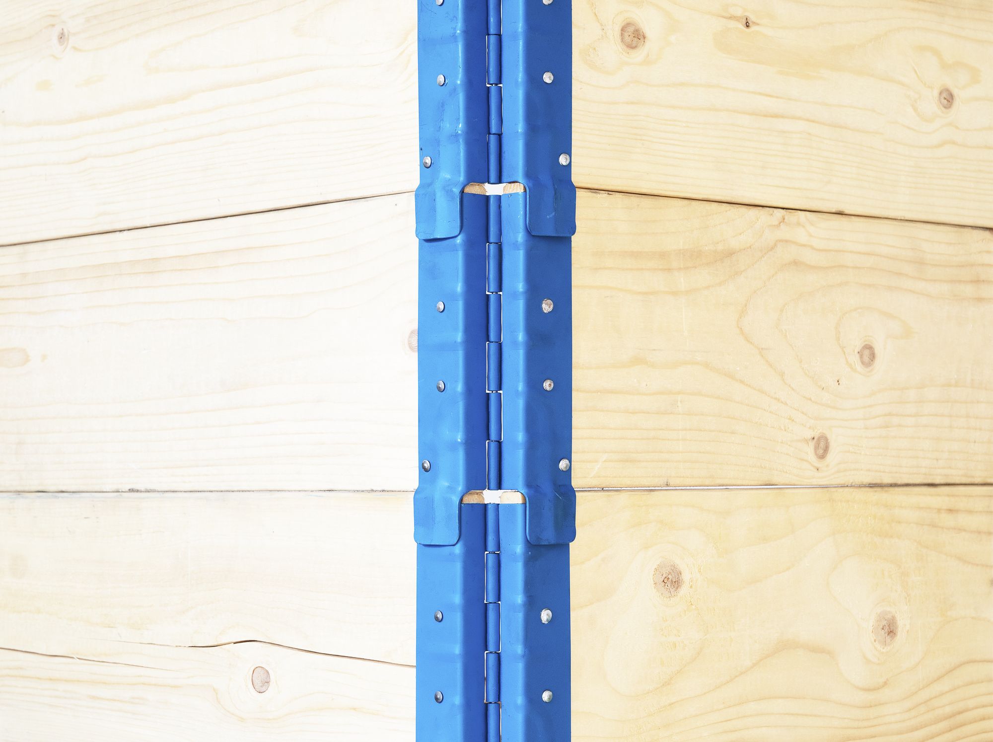
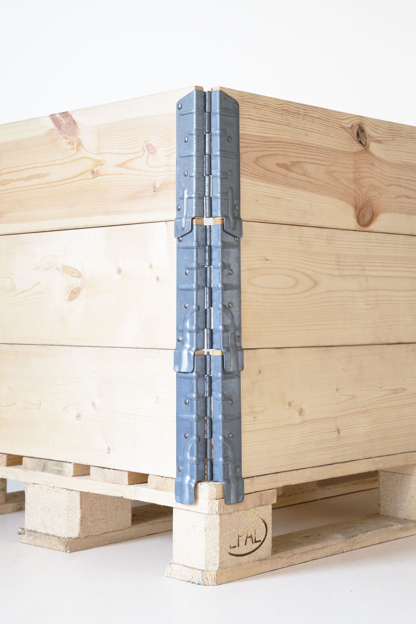
Before any of the branding, there's the object: cold-pressed steel, precise to the millimetre, cut out and shot straight so the engineering does the talking.
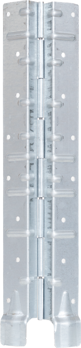
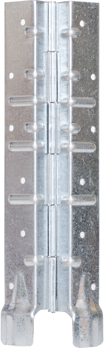
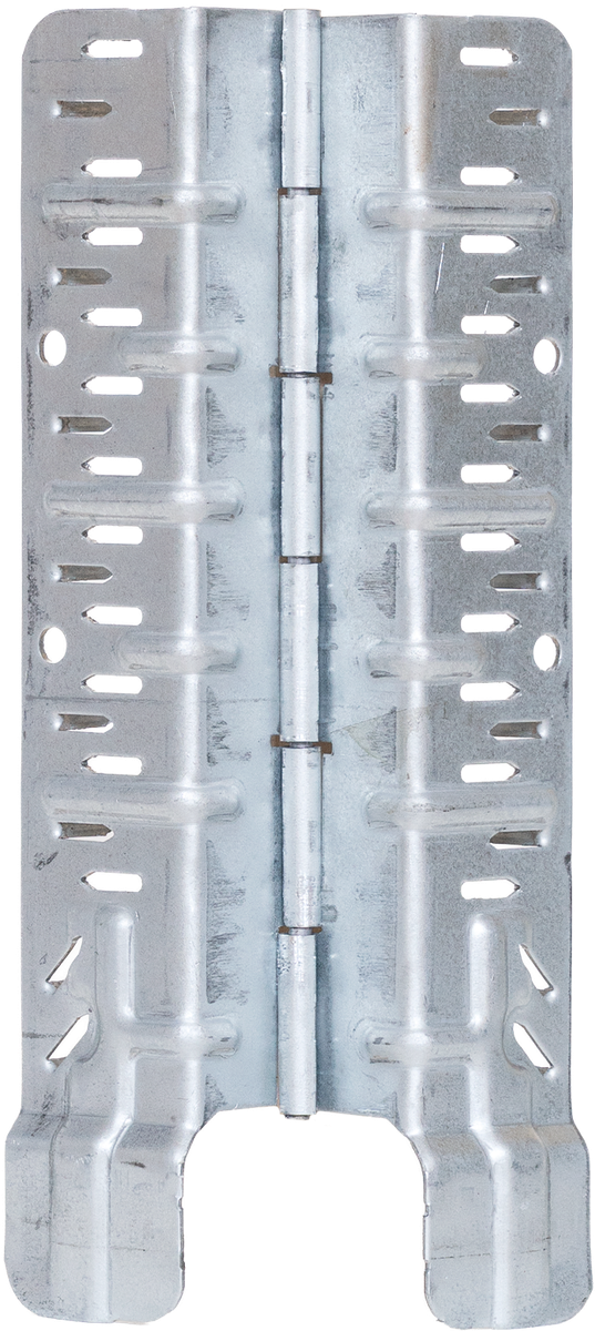
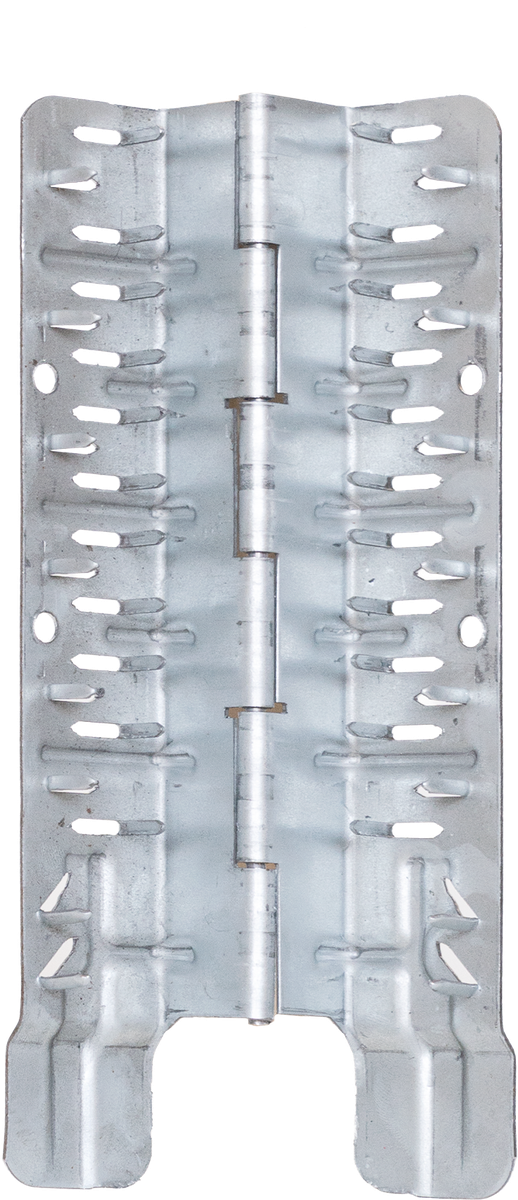
Beauty Shots
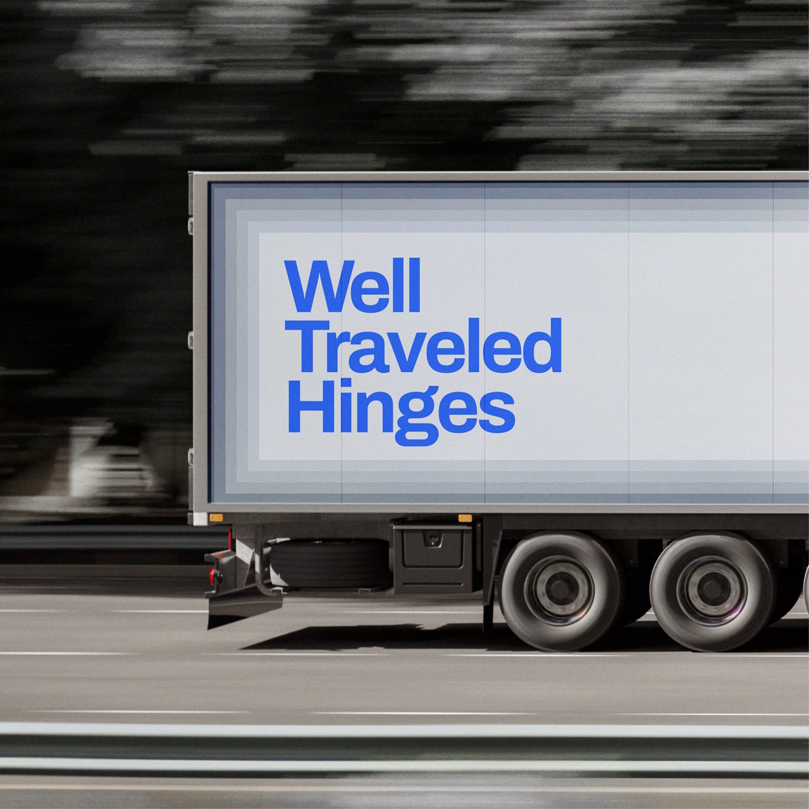
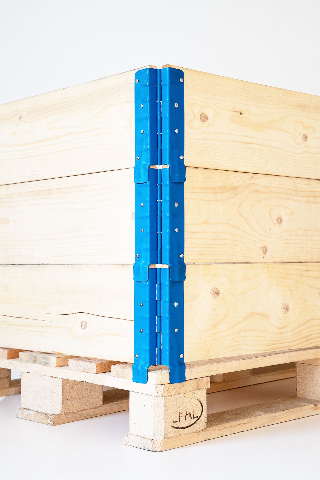
The hinge, styled and lit — steel against field, forest and the open road, letting a piece of hardware look like it deserves the attention.
Where It's Made
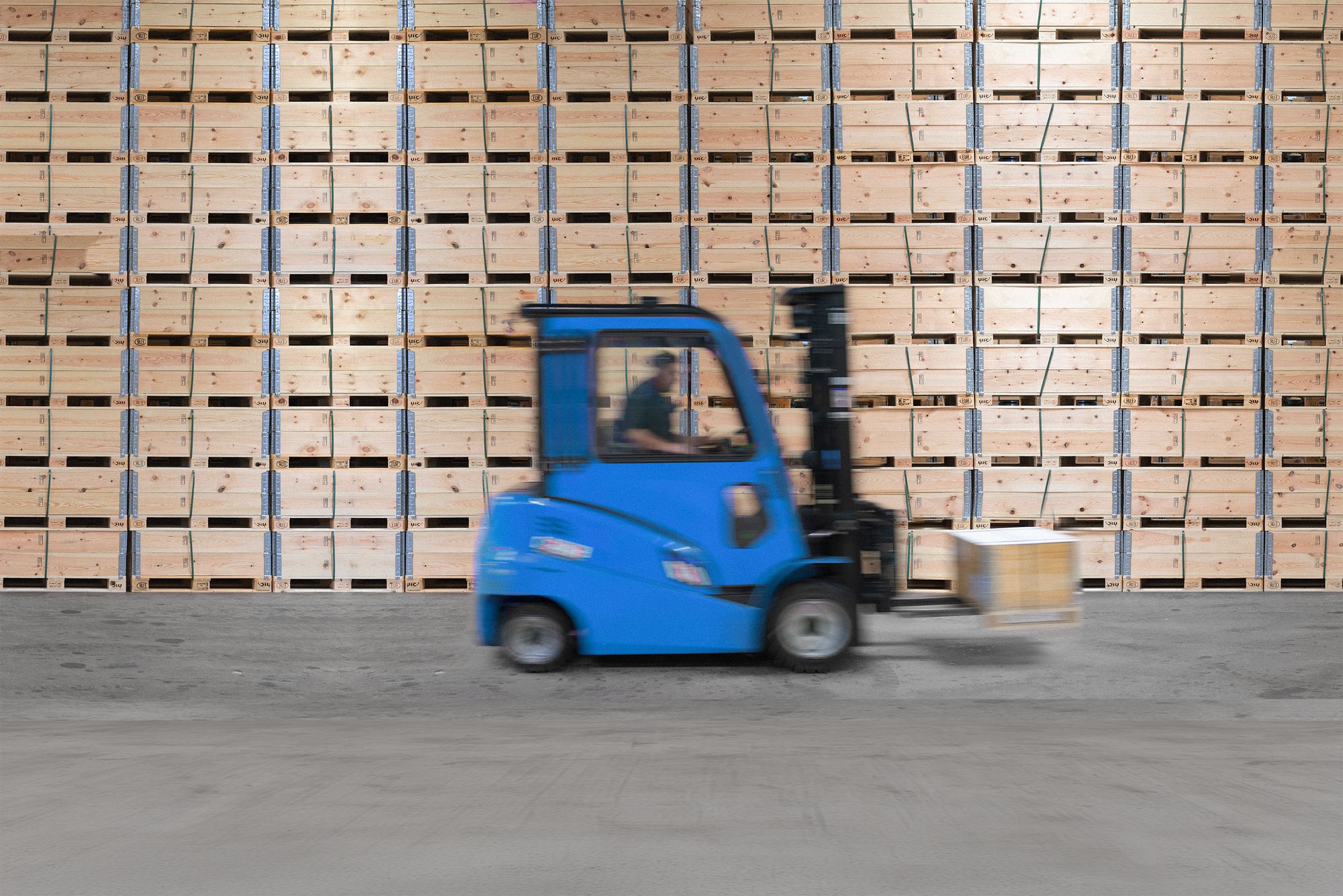
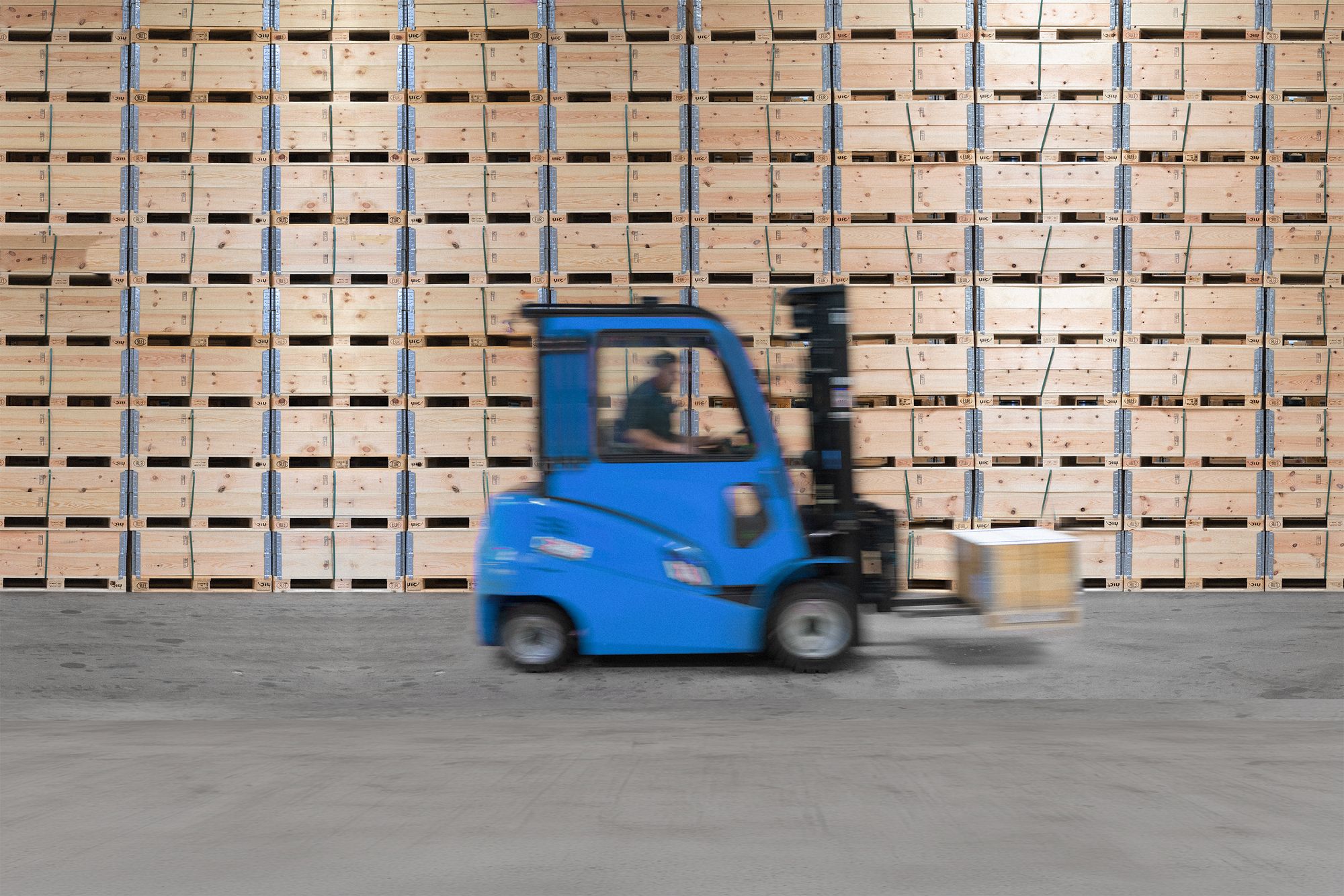
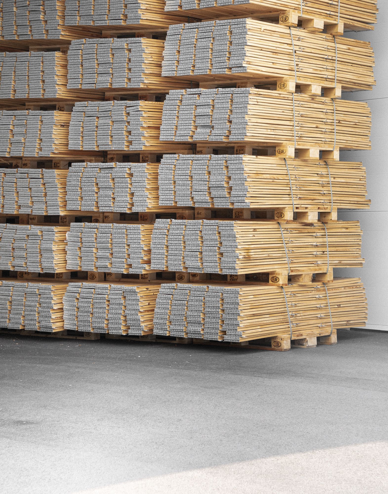
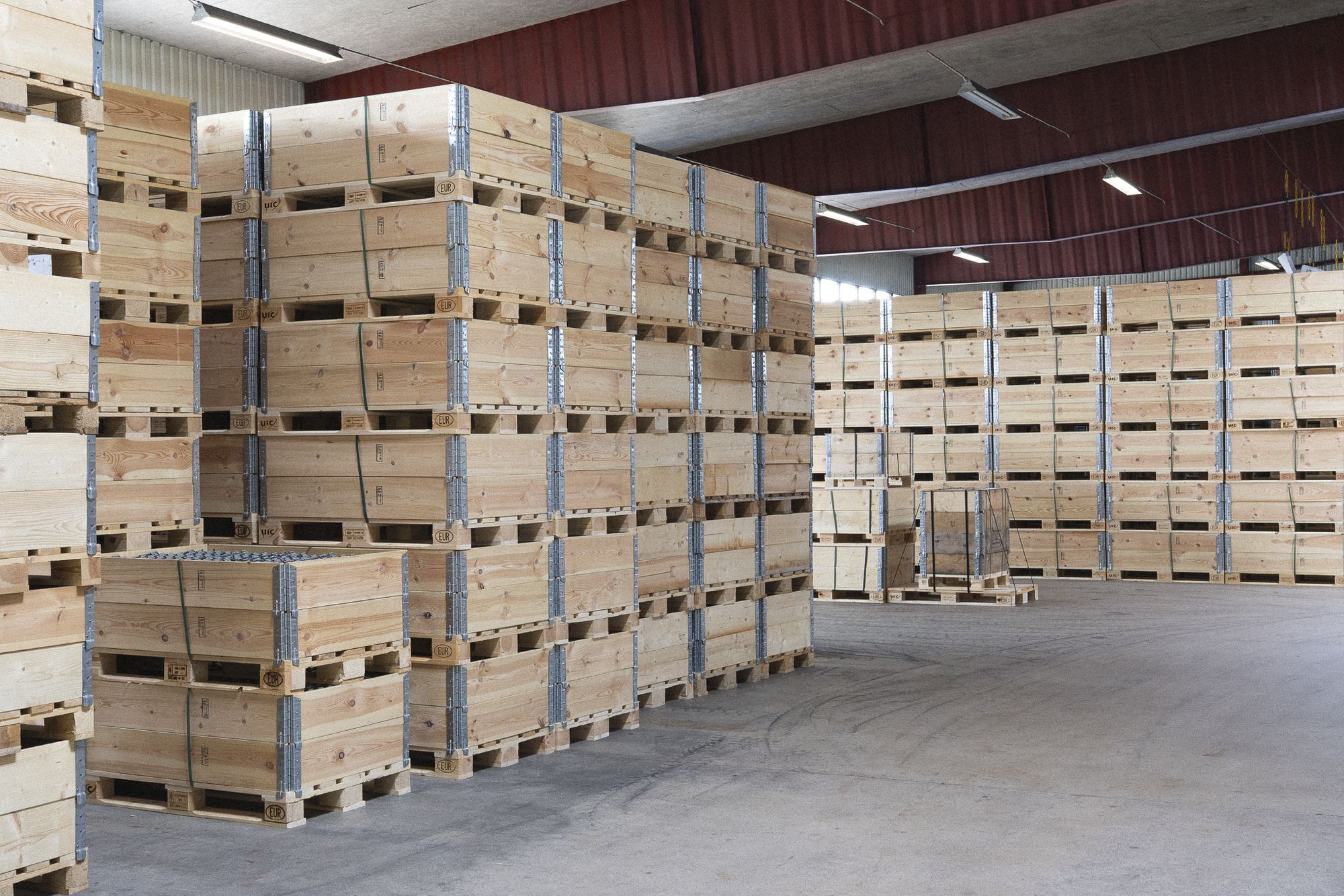
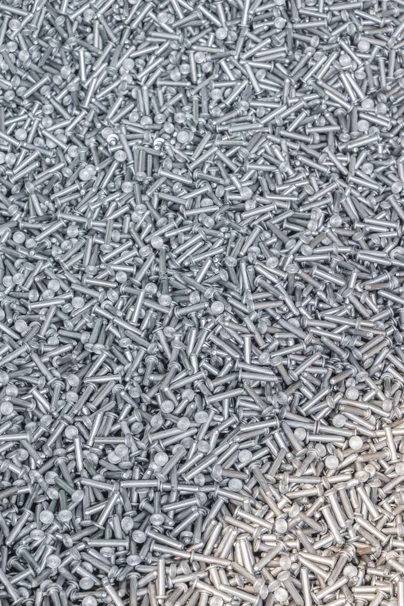
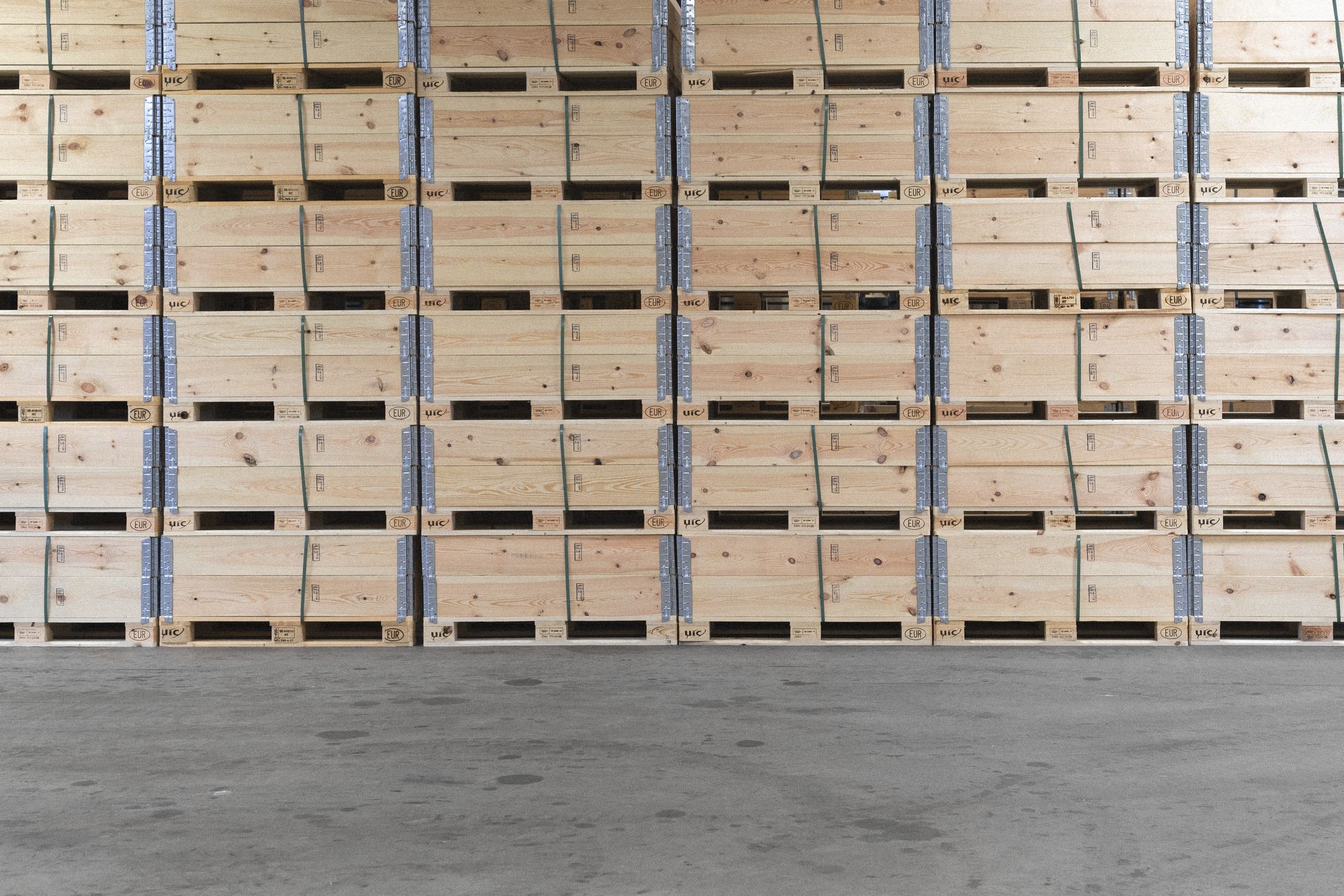
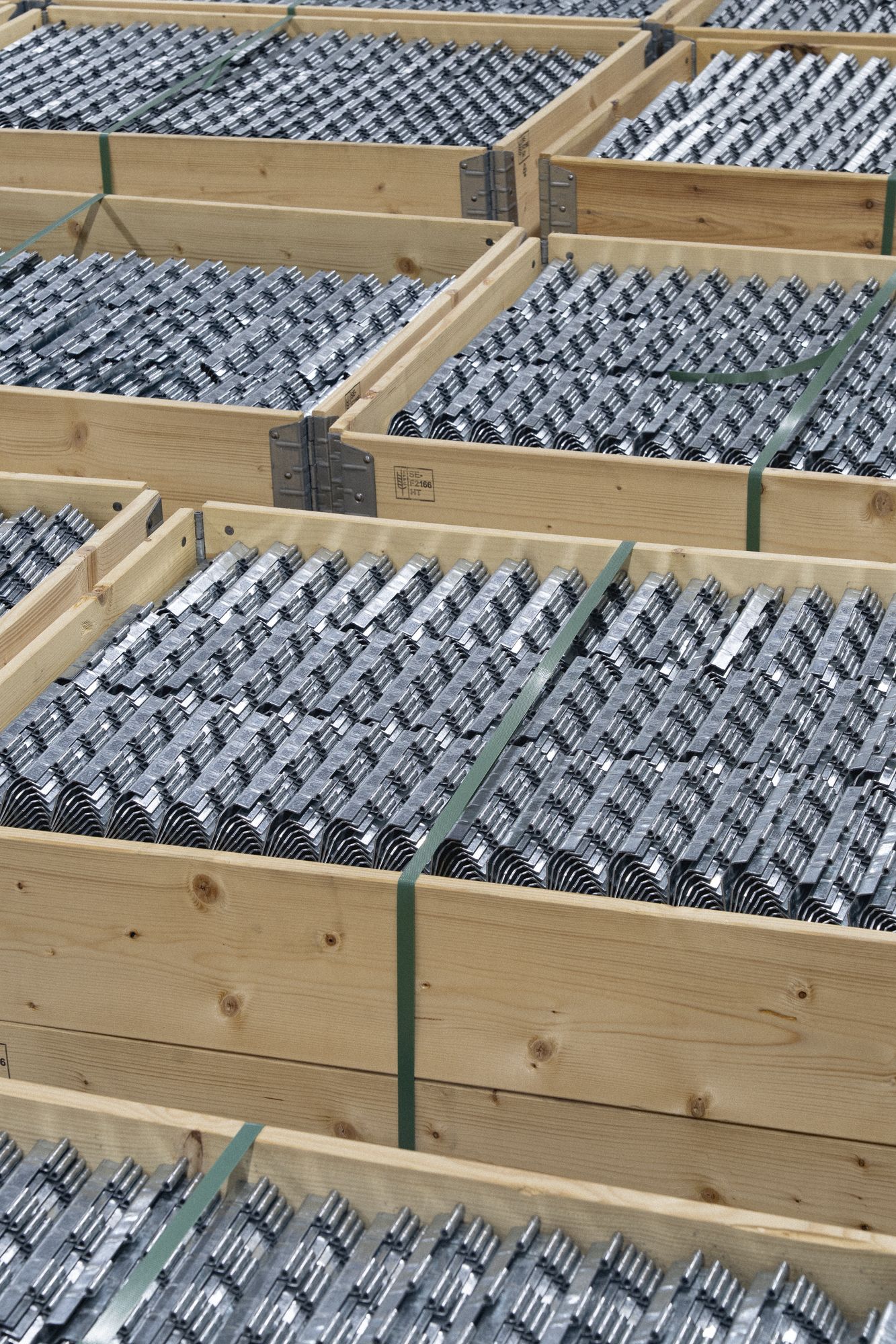
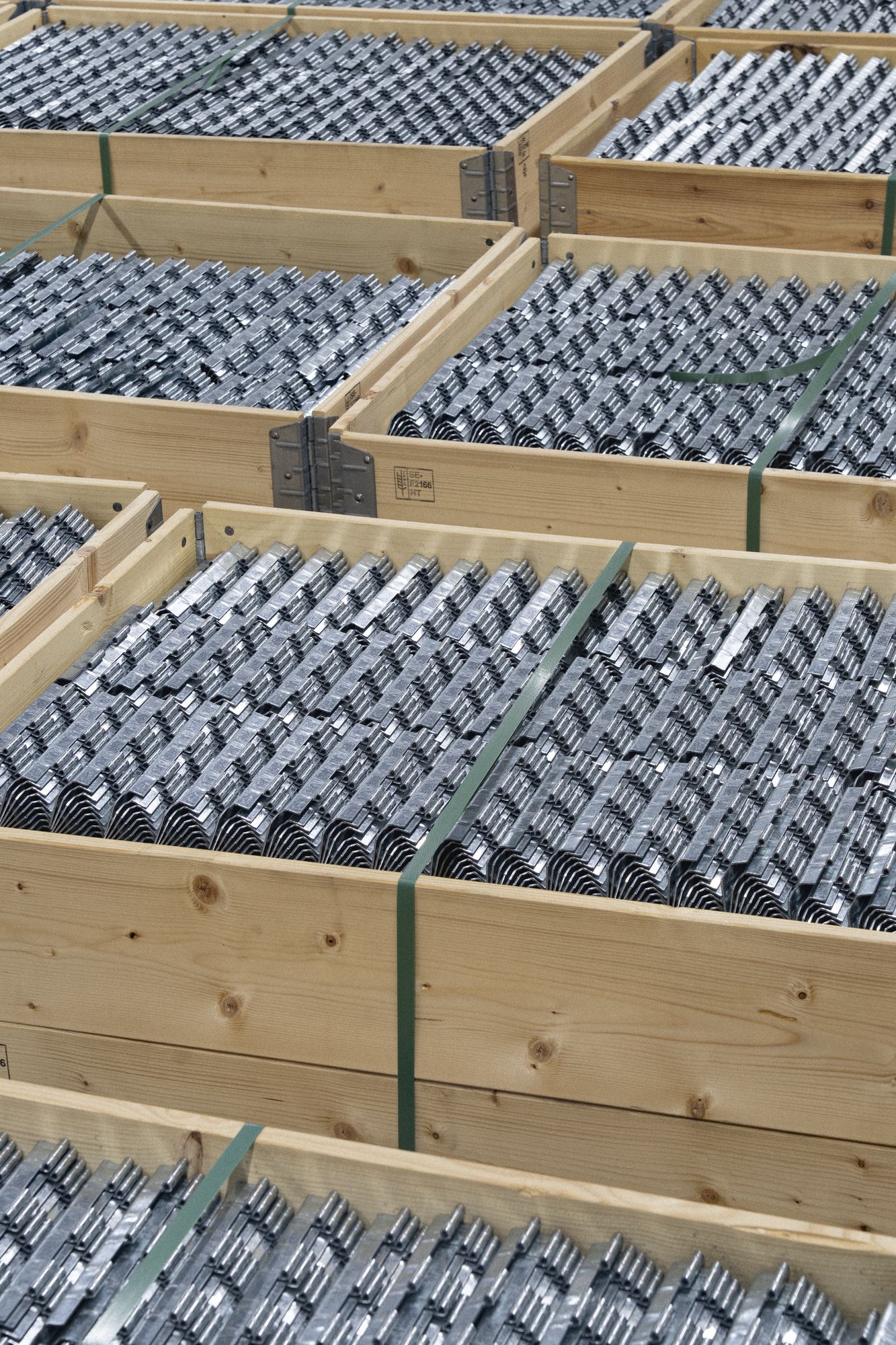
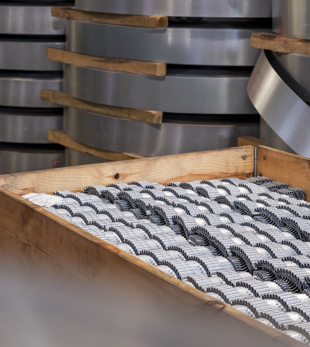
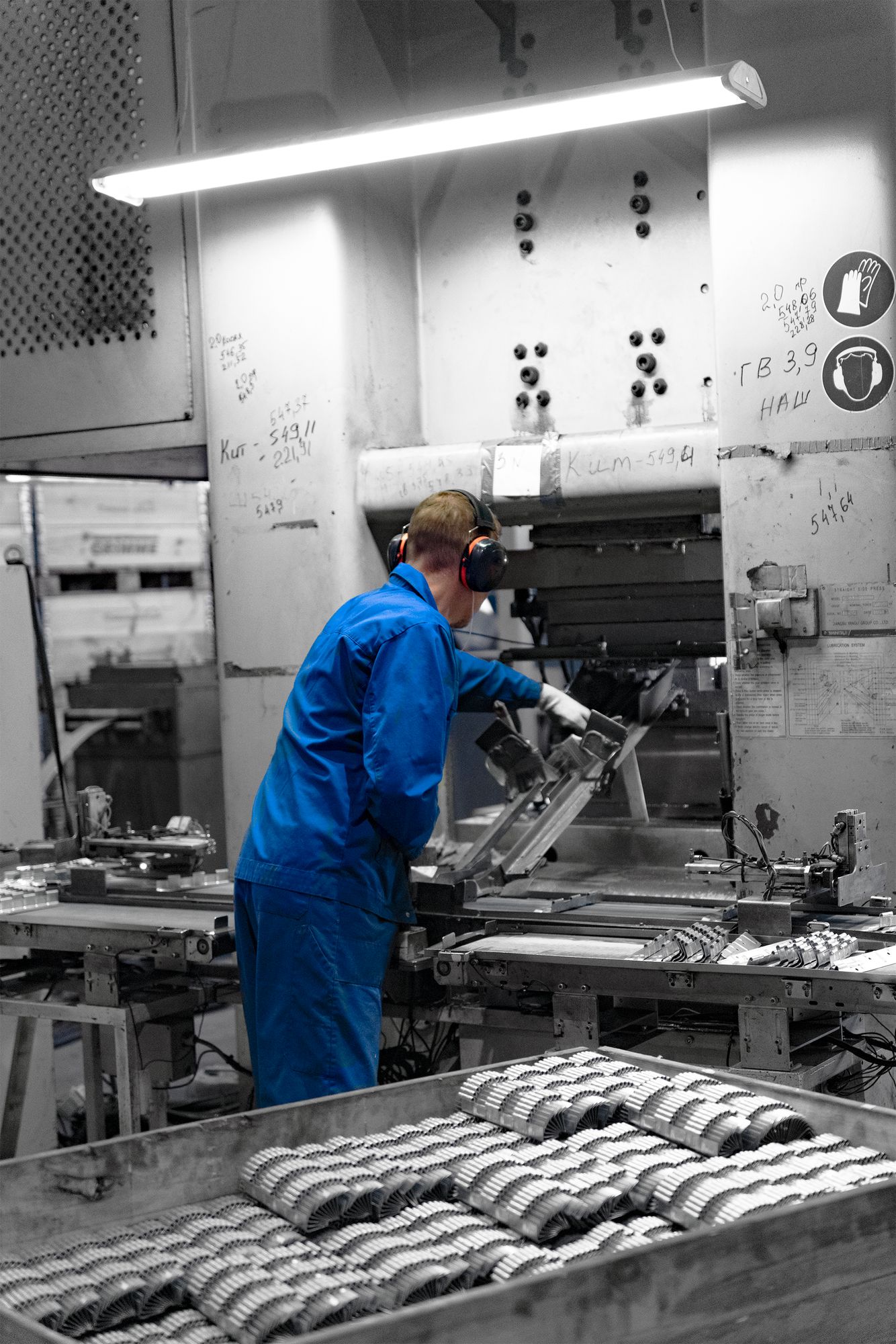
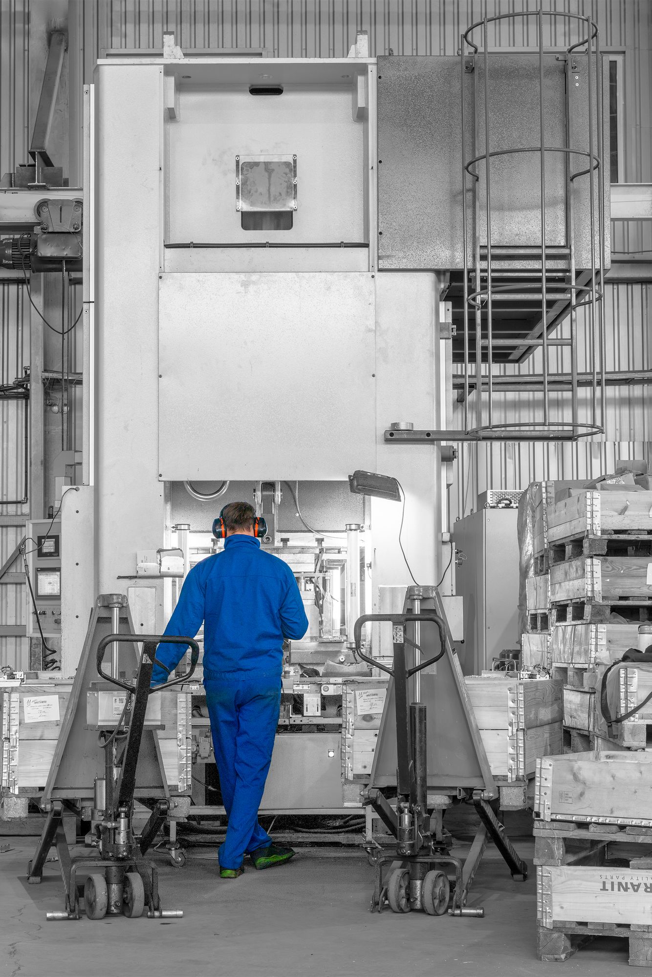
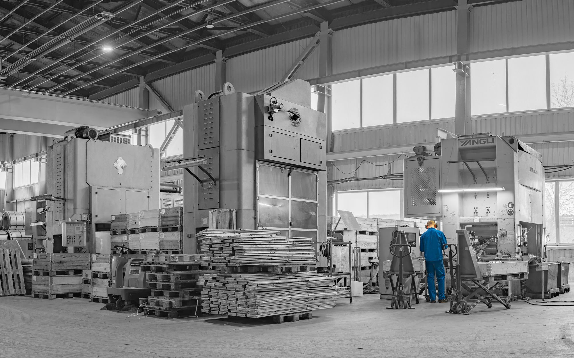
The plant itself — presses, steel and stock — shot with the company blue held sharp while the rest falls back into grey.
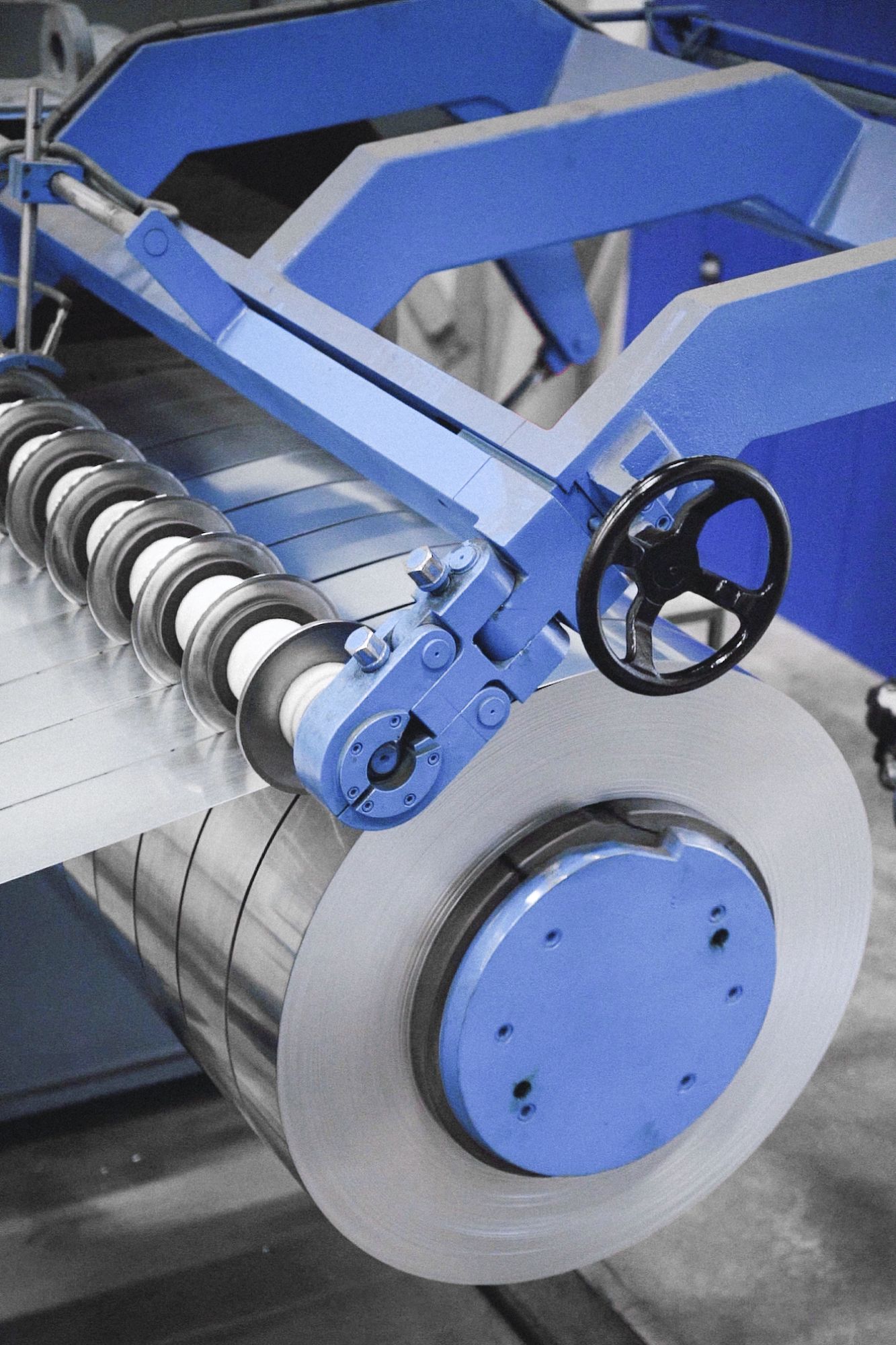
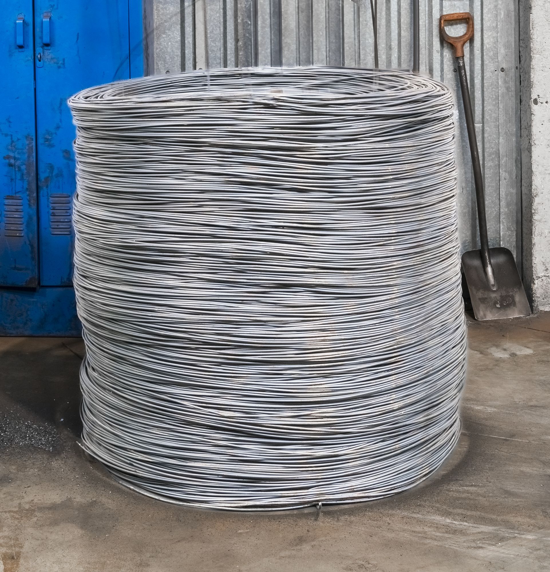
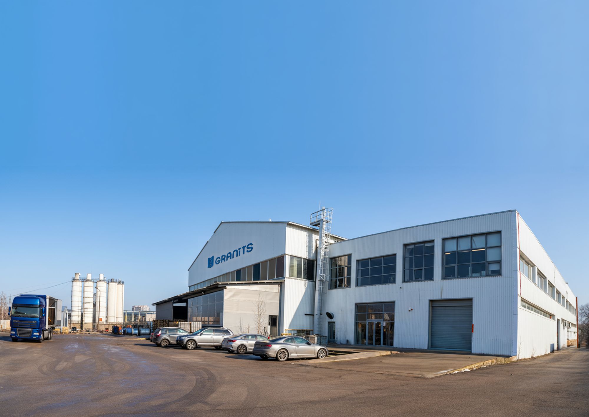
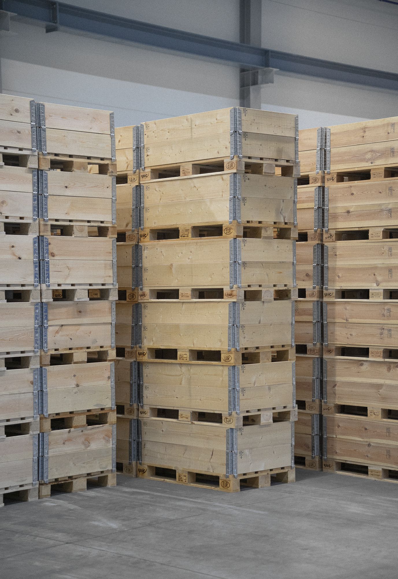
Blue Against Steel
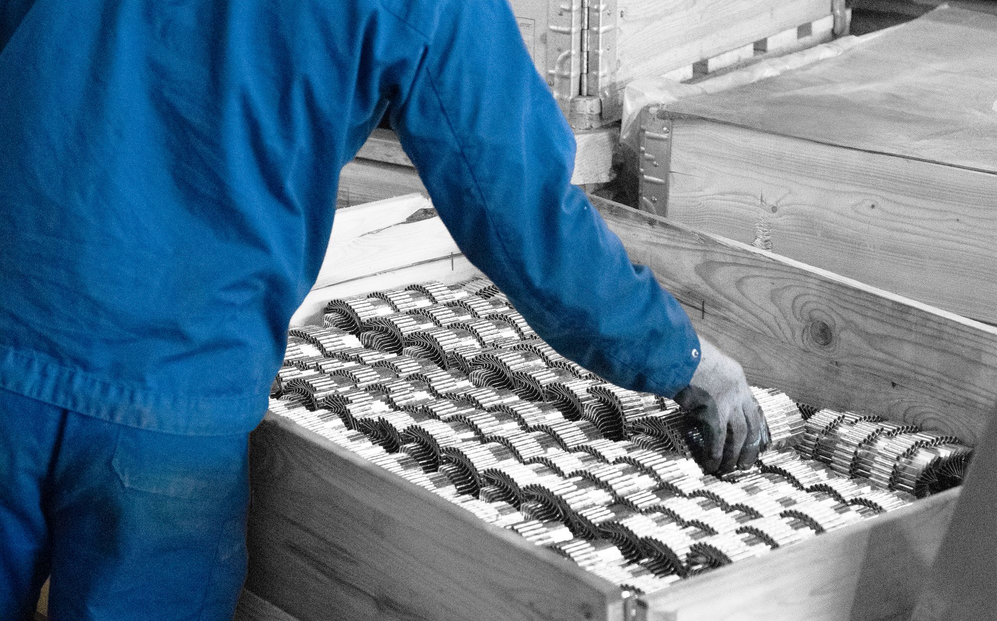
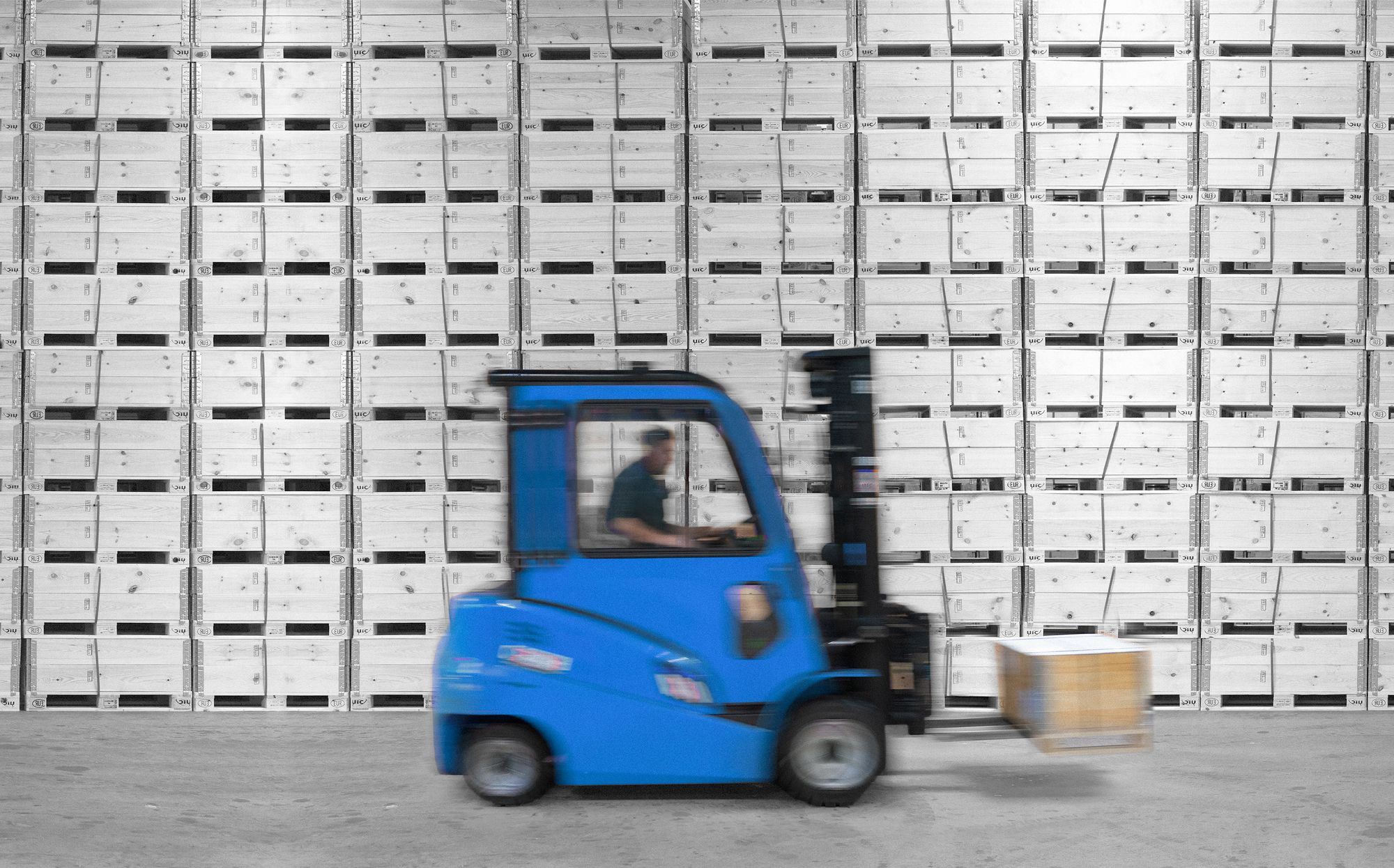
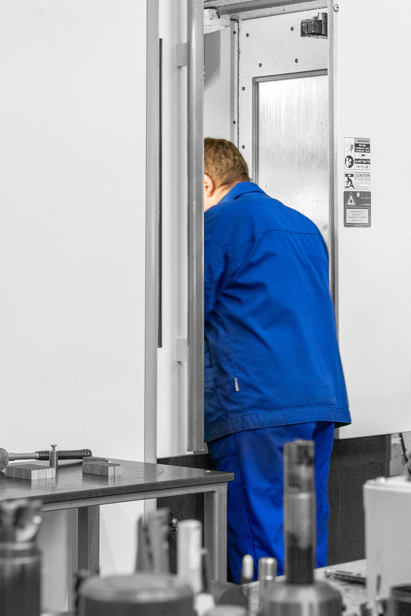
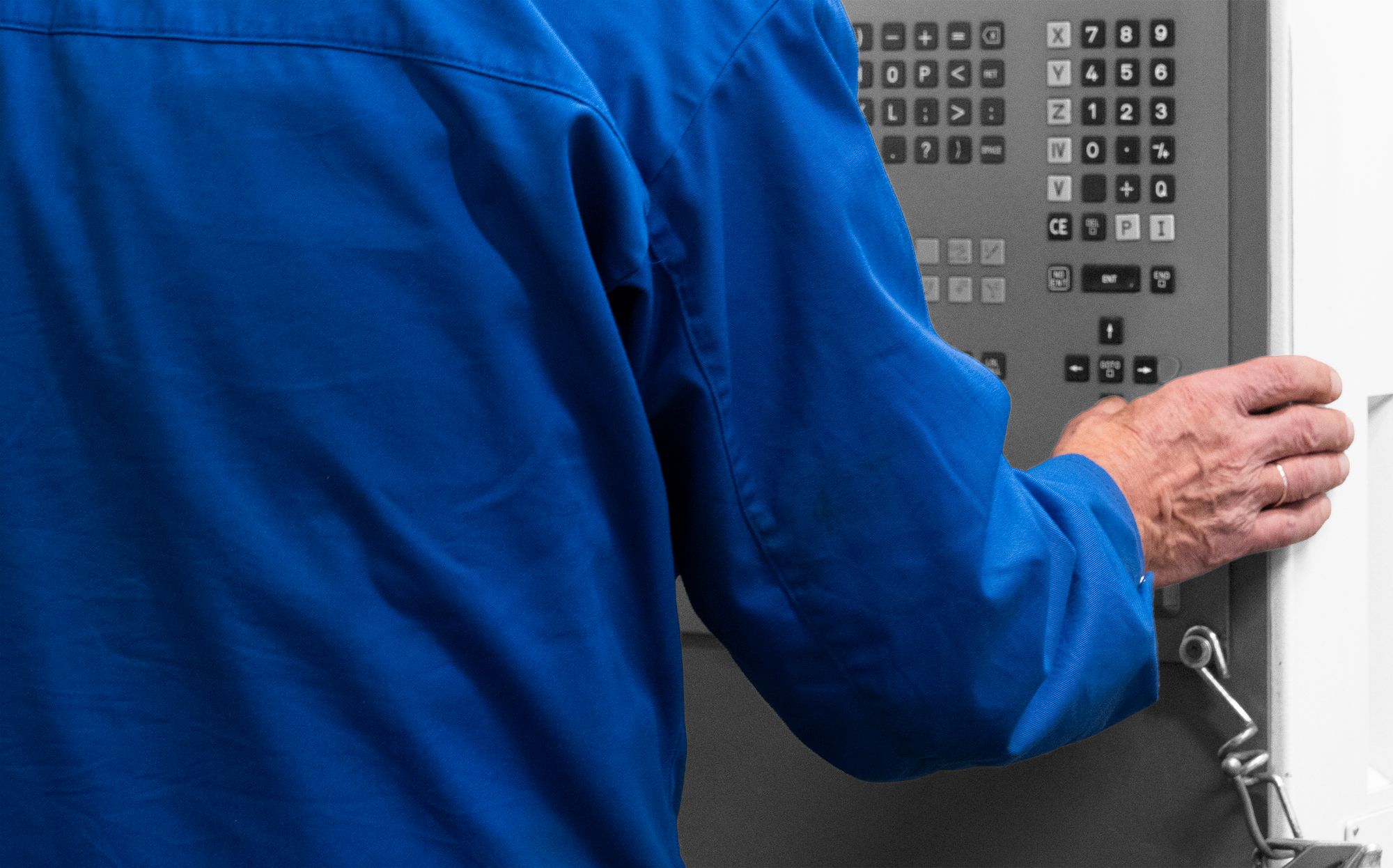
The people who make it. The whole visual language runs on one move: the brand blue on the crew stays in colour while the shop floor around them turns grey.

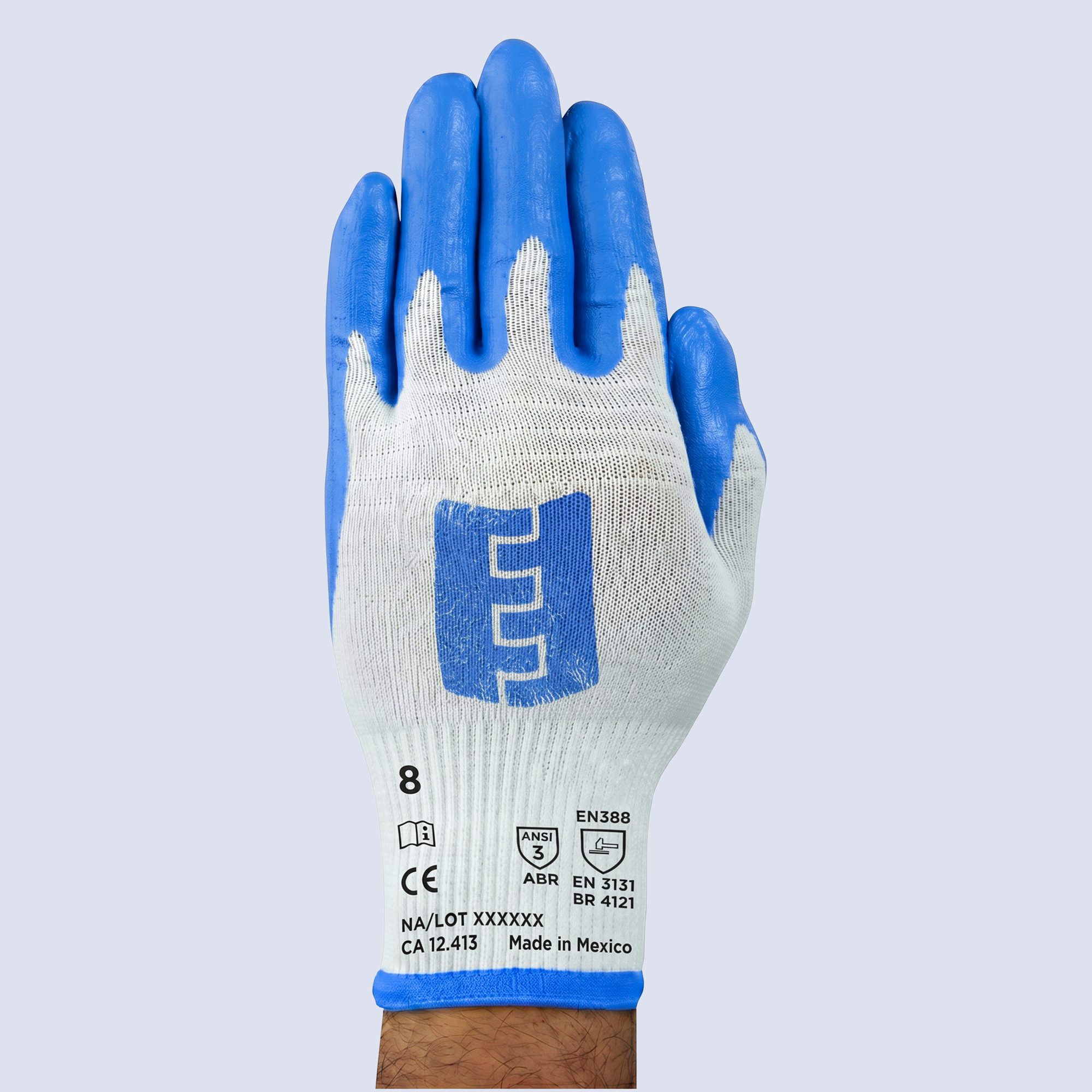
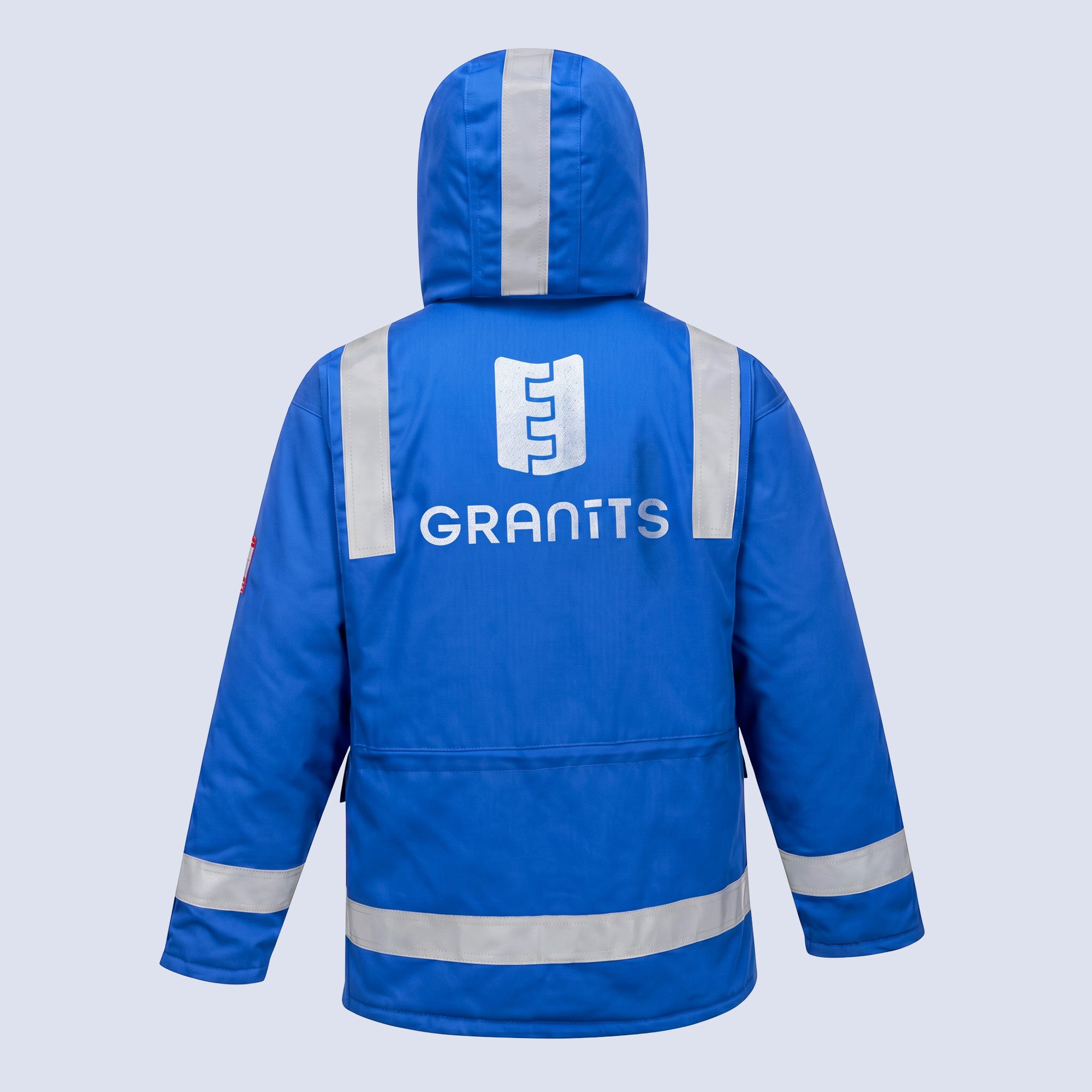
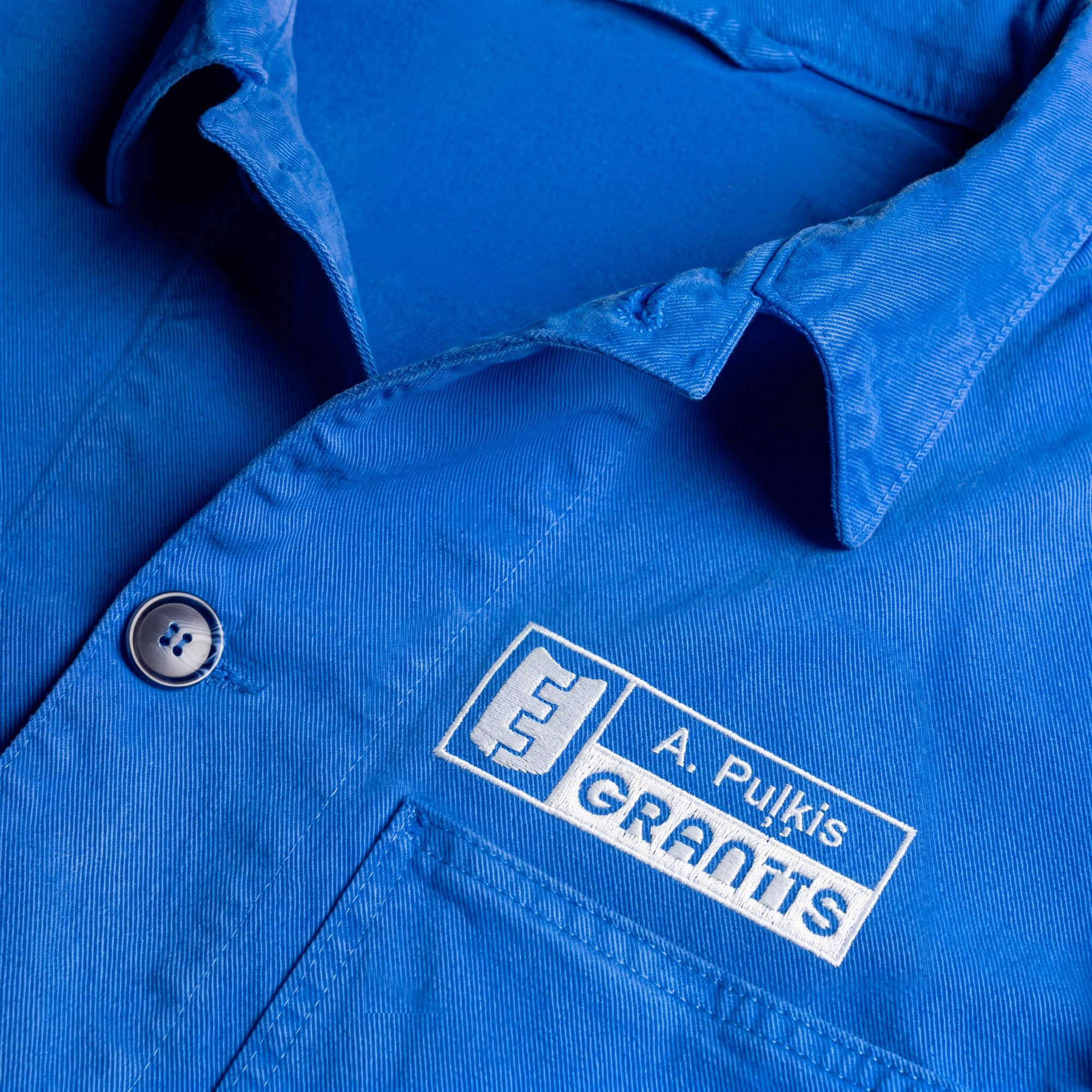
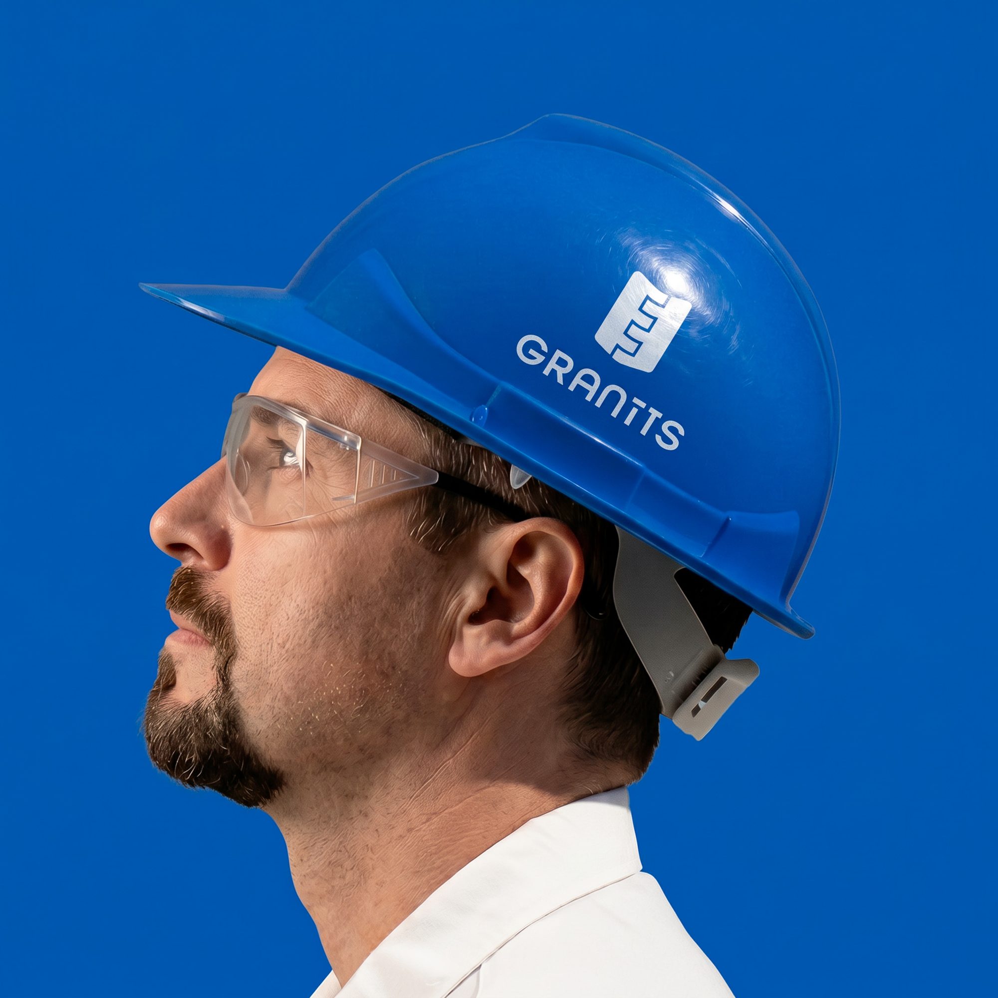
Dressed for the Job
Kit that reads as one team from across the floor — a branded jacket, gloves and name tags, all in the company blue.
Off the Clock
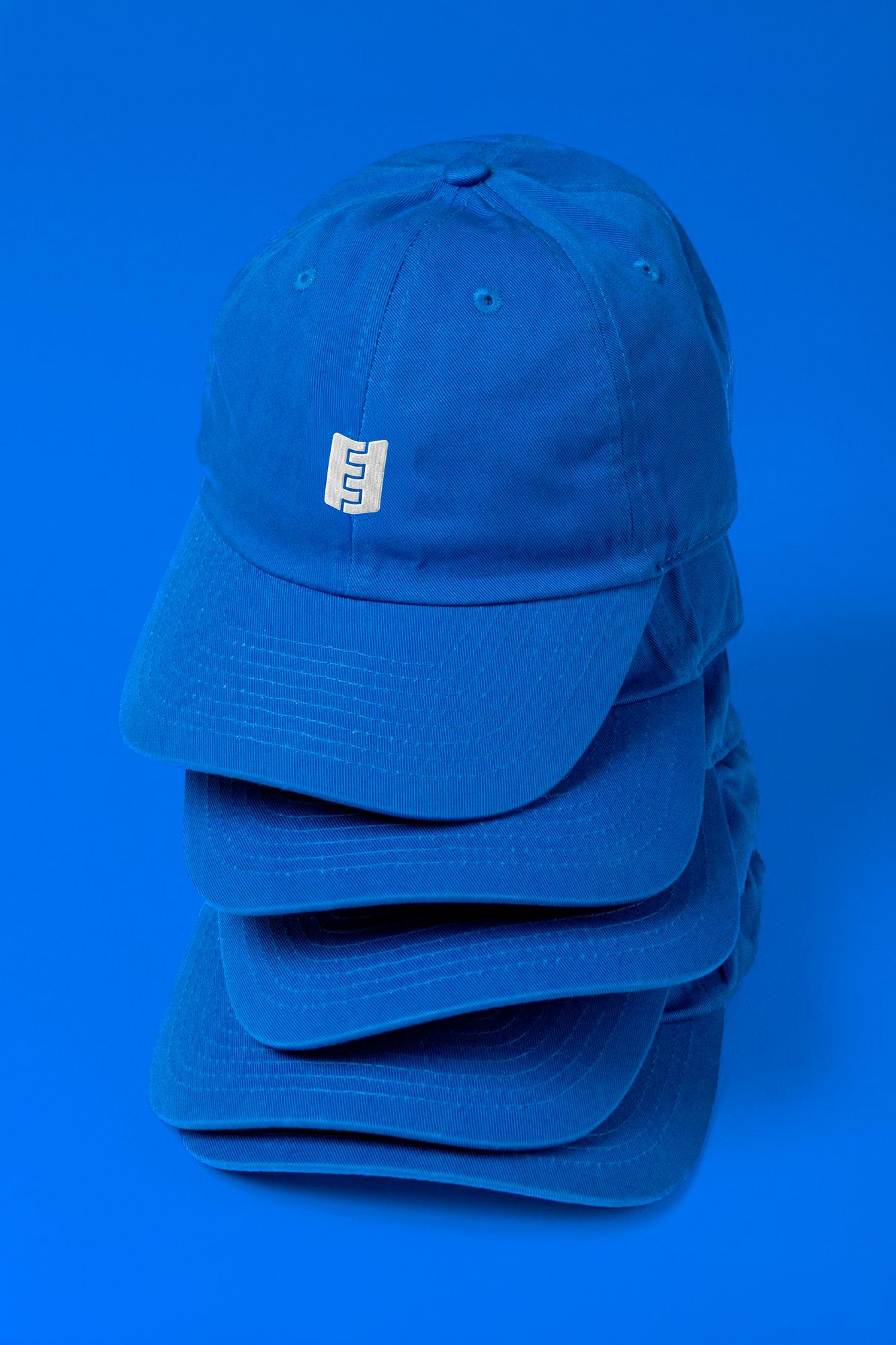
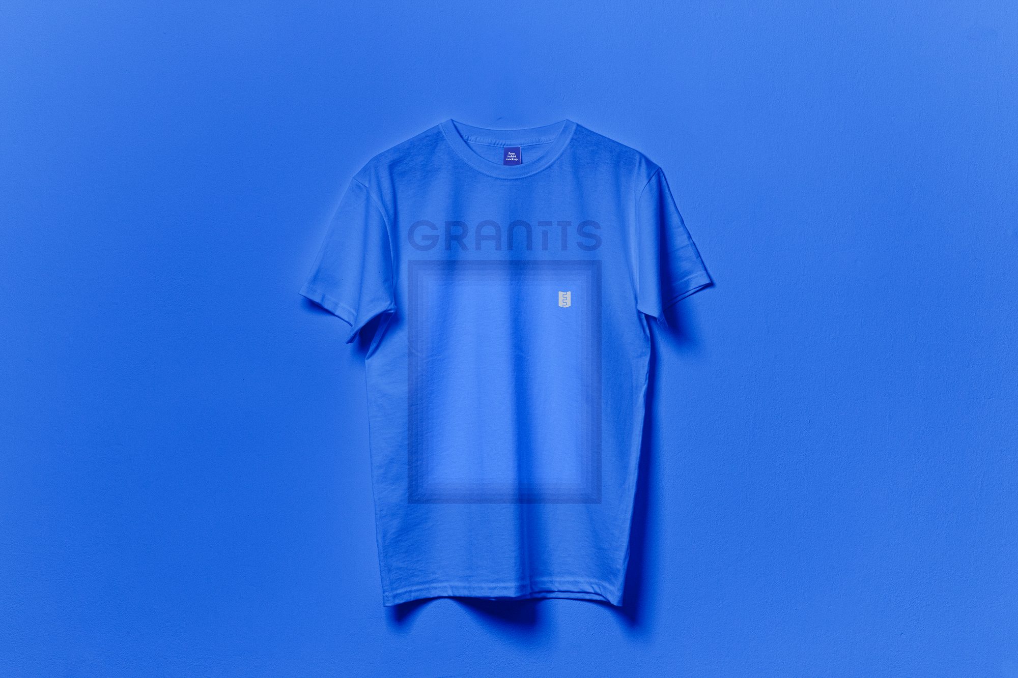
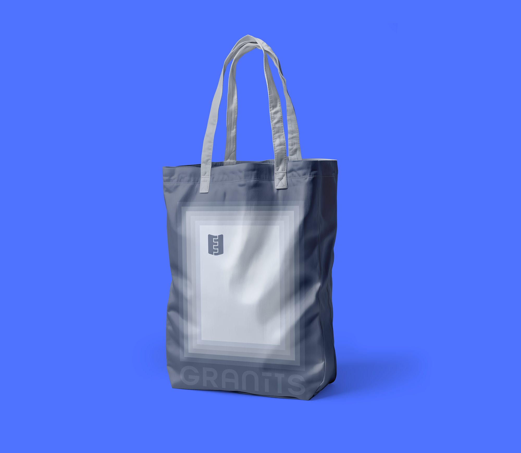
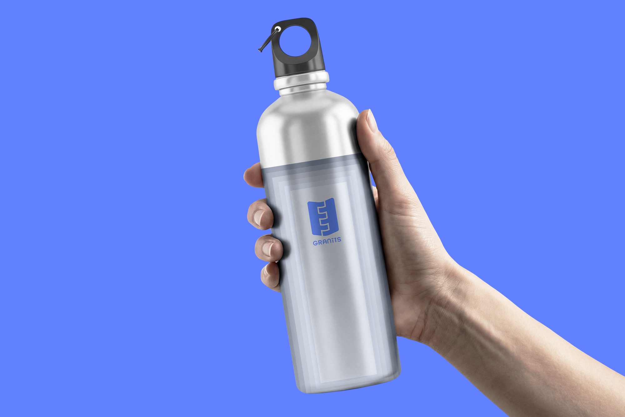
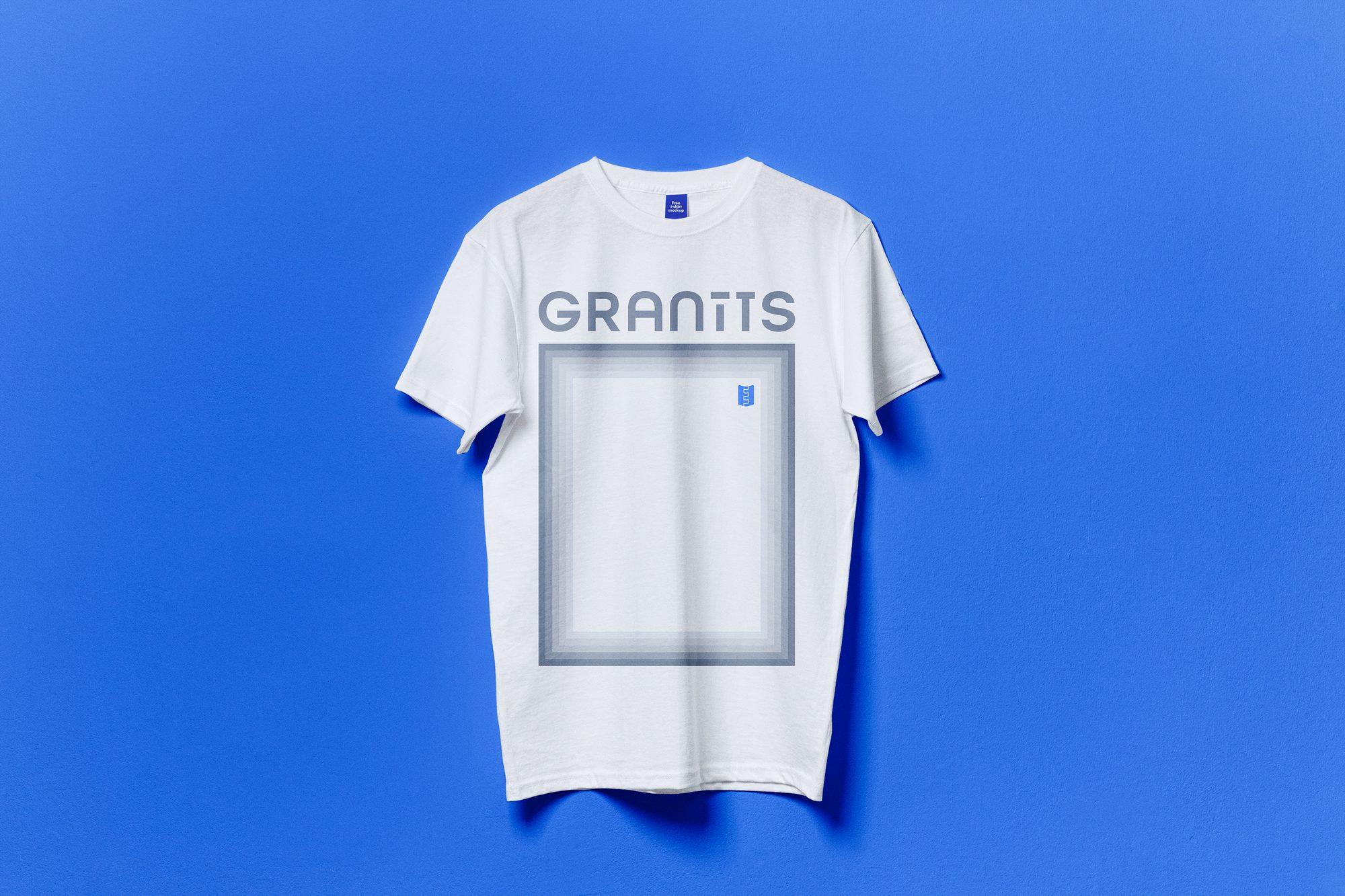
Pieces that carry the mark past the factory gates — totes, bottles and blue-on-blue basics for the crew and everyone who roots for them.
On Site
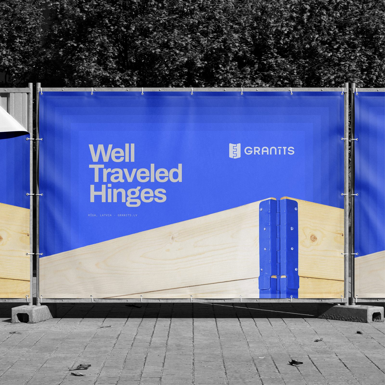
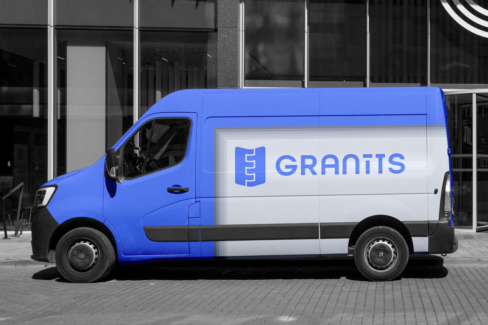
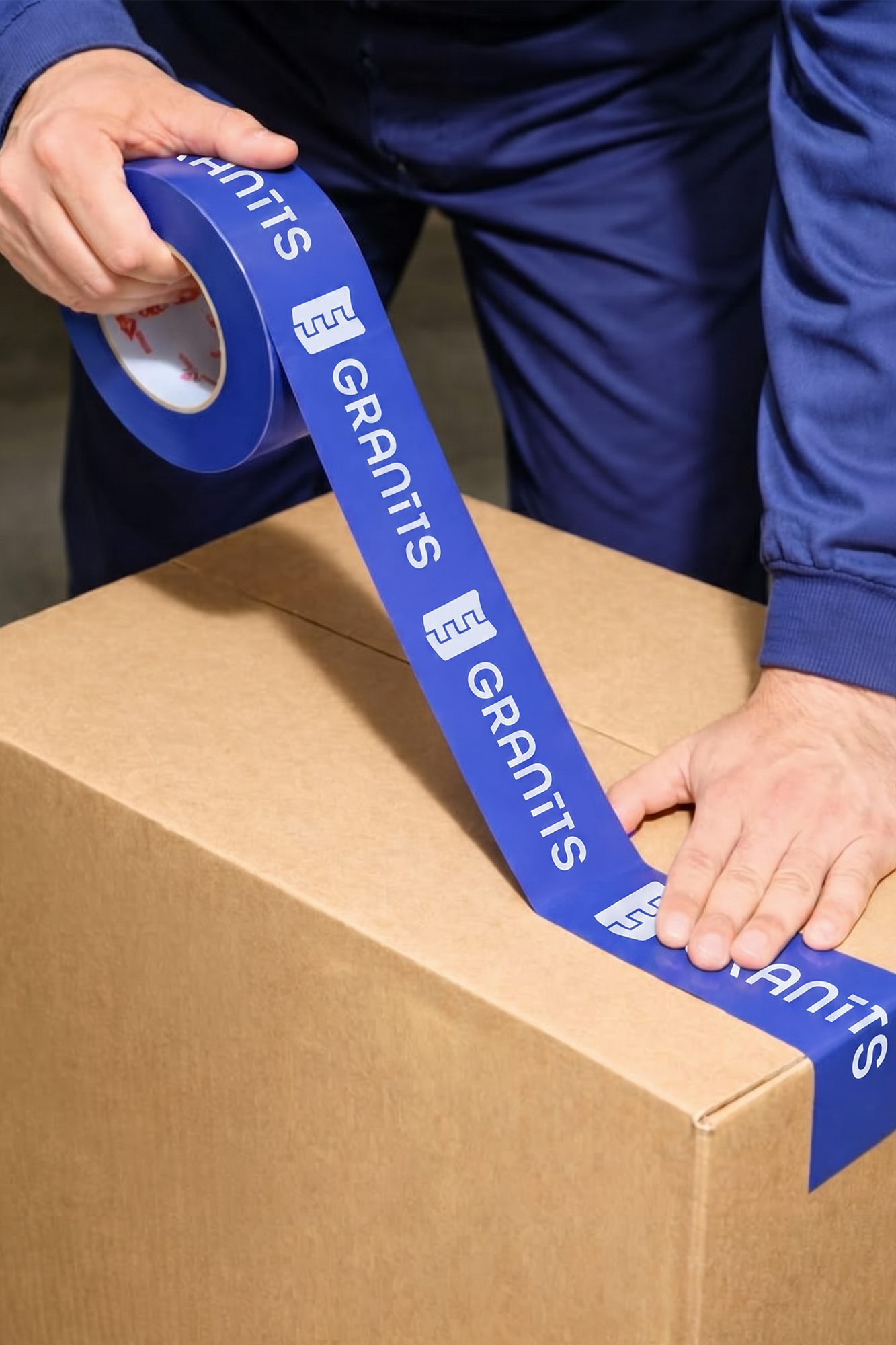
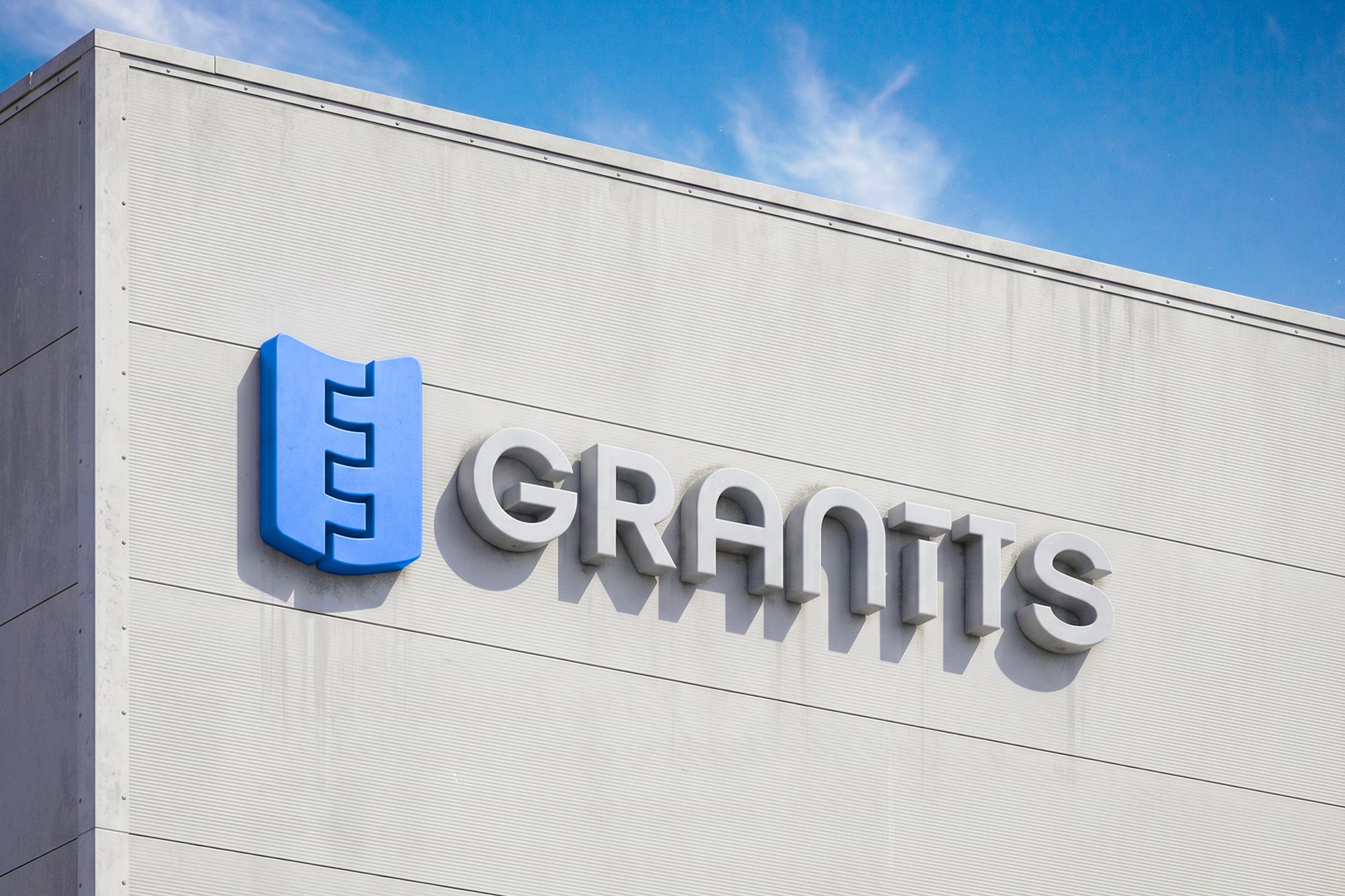
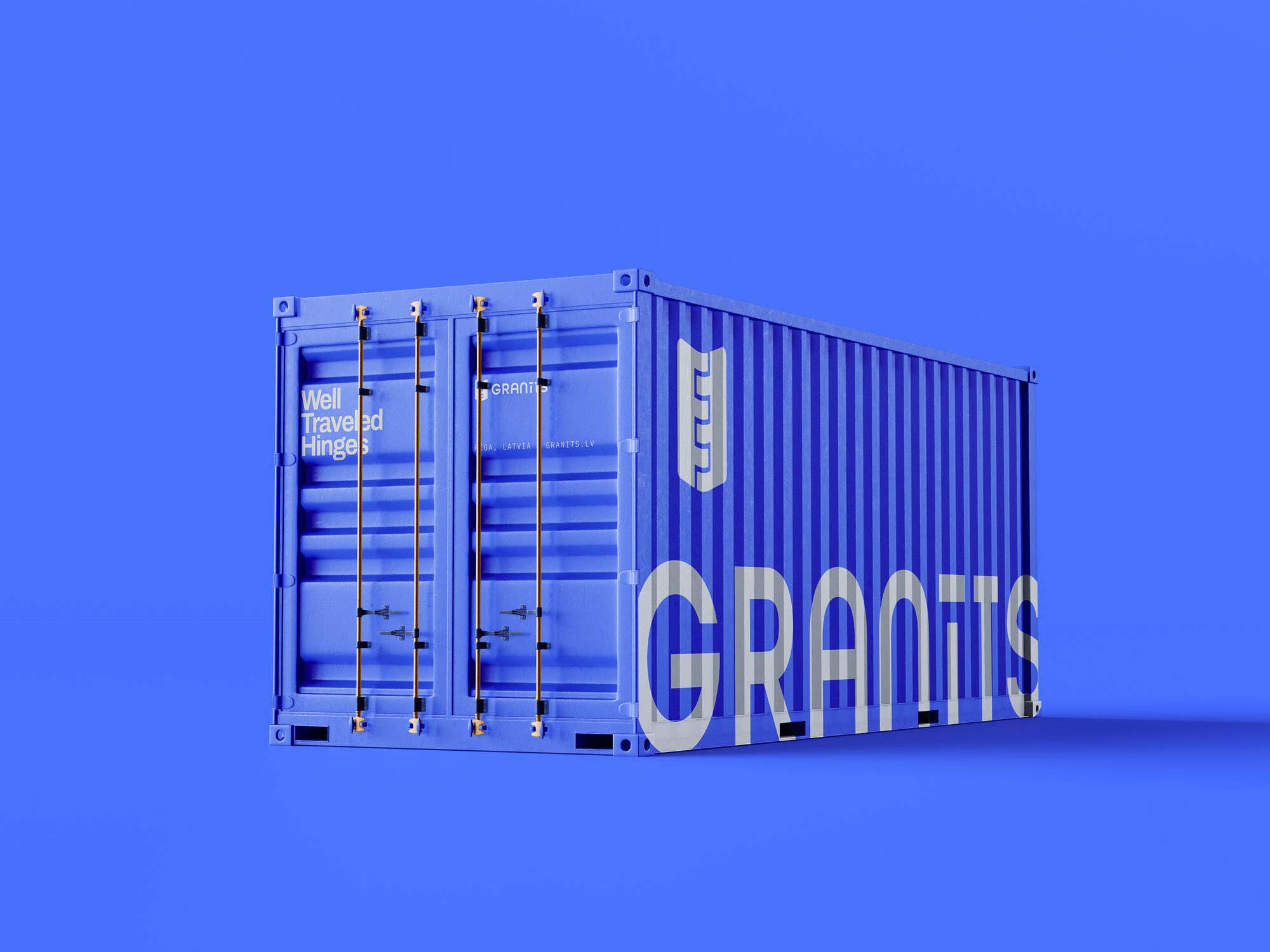
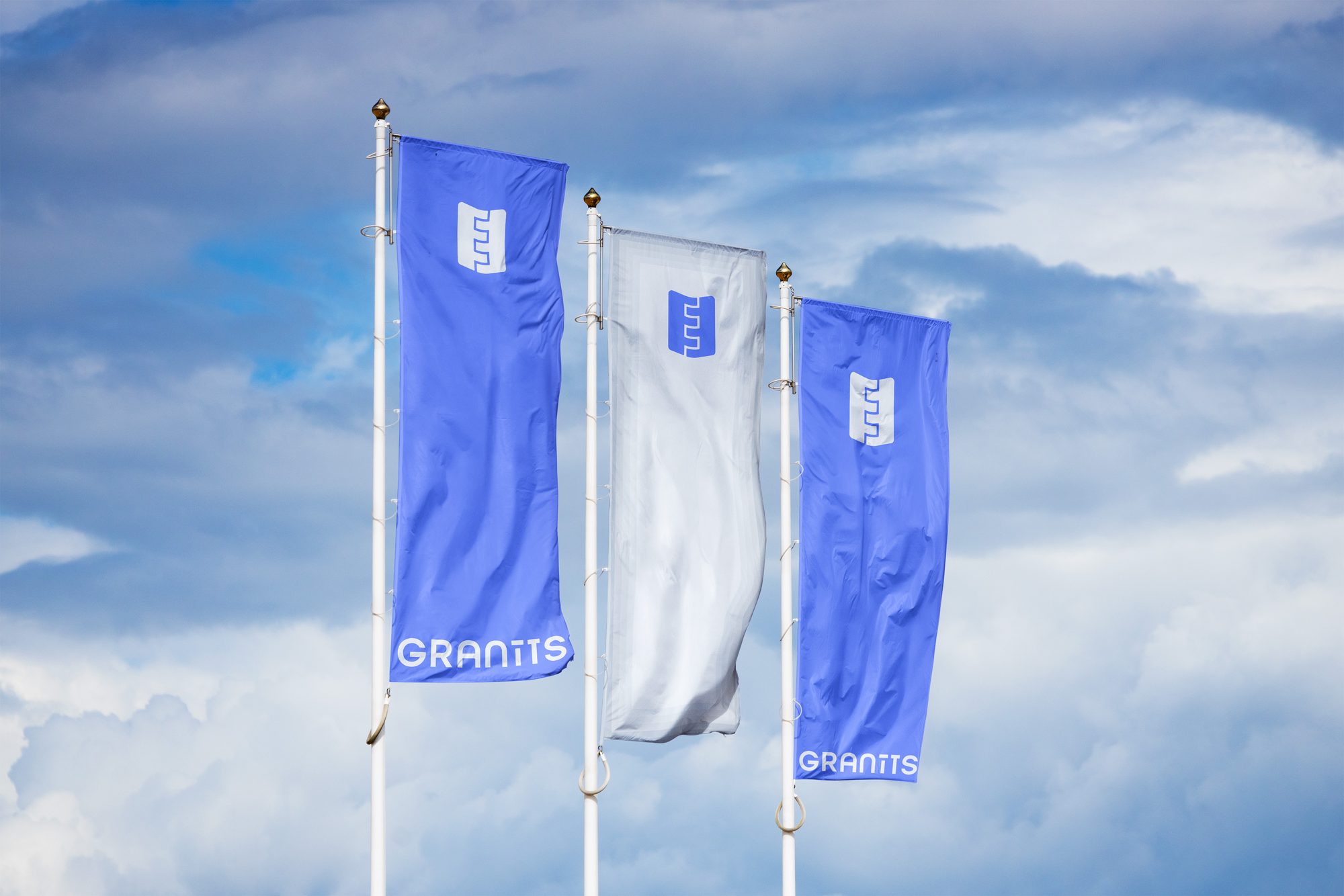
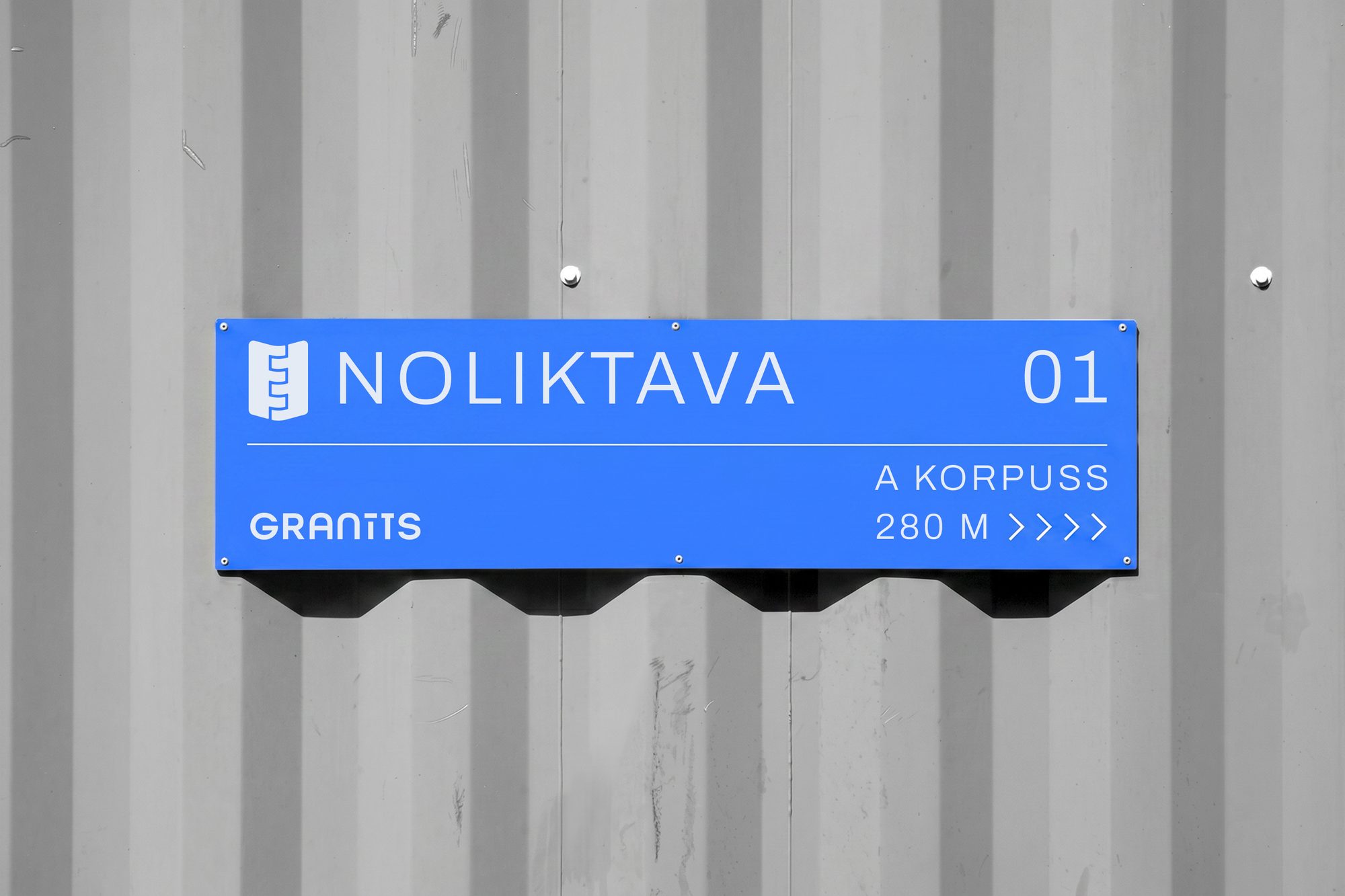
Signage, flags, containers and the small on-site details that make the plant itself part of the identity — the same mark and blue, scaled up to building size.
Online
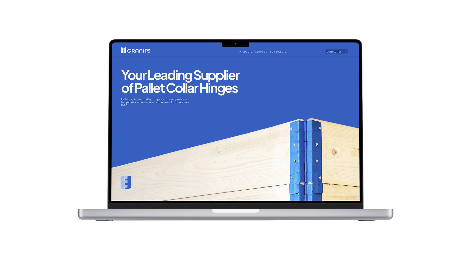
A clean, catalogue-led website that puts the specs first — built on the same grid, blue and hinge logic as everything else.
The Paper Side
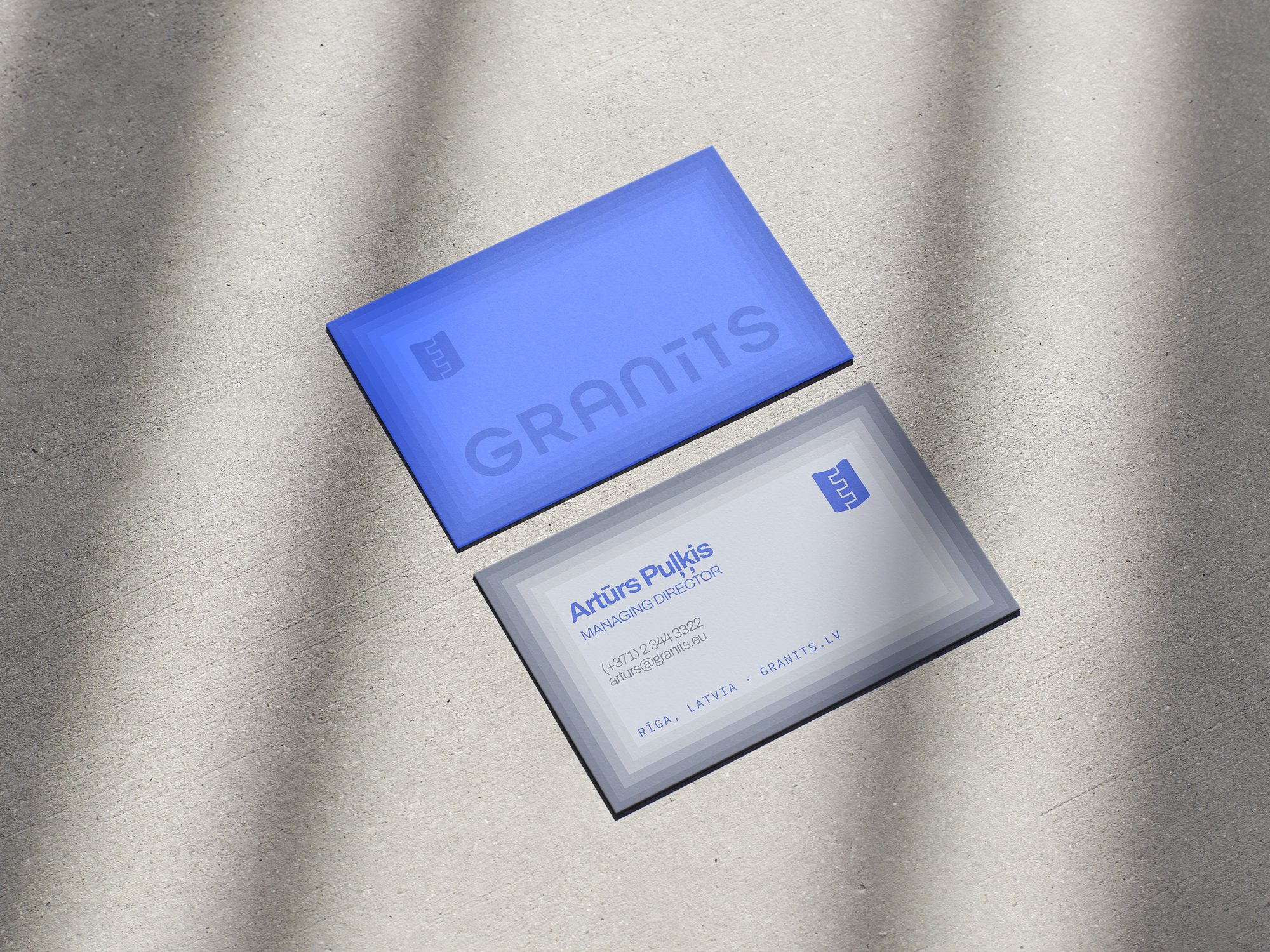
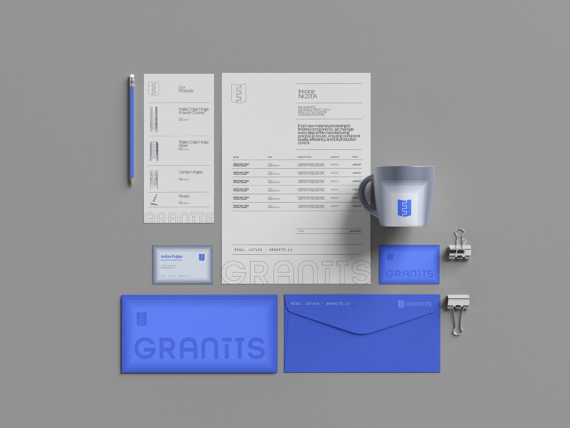
Business cards and correspondence built on the same industrial tone — plain stock, precise margins, the mark used small and confidently.
Sheet into hinge. Precise, every time.